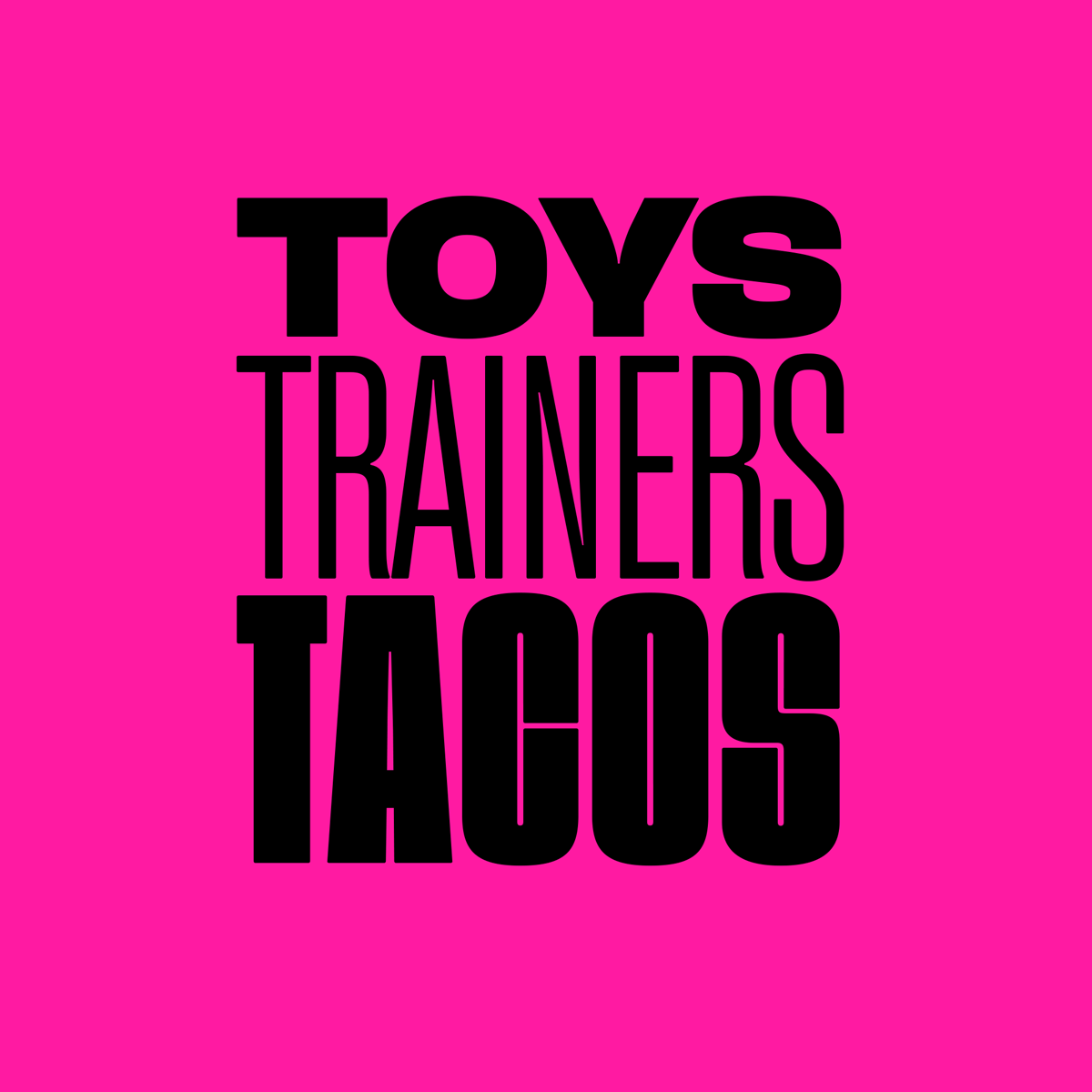
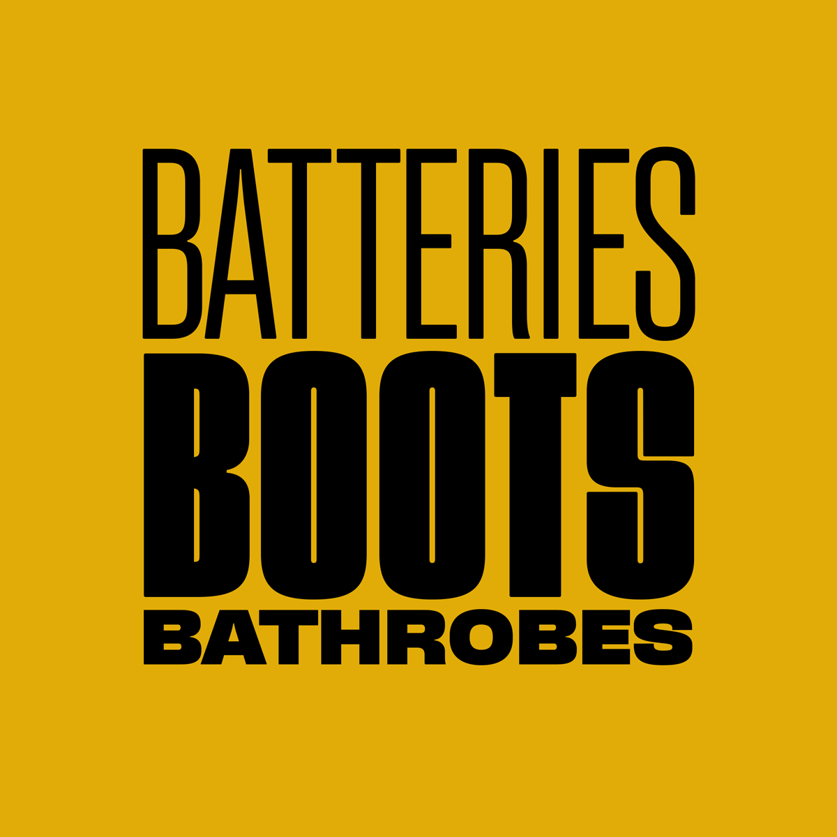
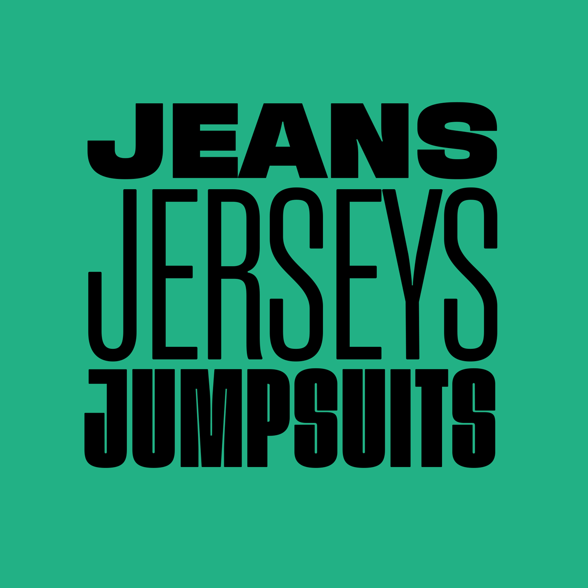
The Broadway, located in the heart of Bradford, West Yorkshire, opened its doors on 5th November 2015. The £260 million development was the newest and most anticipated shopping destination for a generation, and has revitalised the city centre with its 570,000 sq ft complex. The management team approached us to completely rebrand and reposition them from a shopping centre into a complete leisure destination.
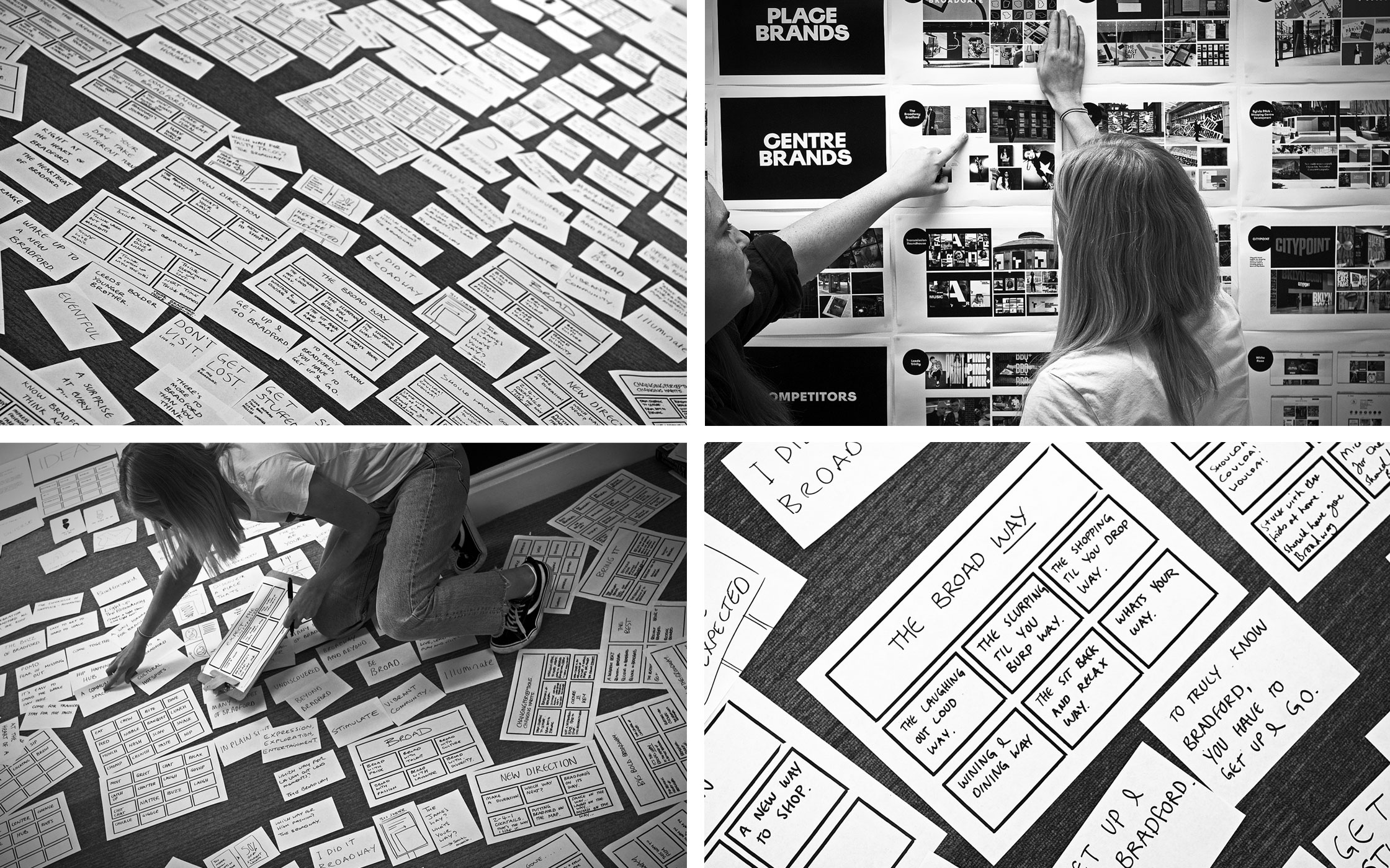
Our winning pitch was a whole story in itself about thinking differently (click here to read!) and then our creative work began on the branding project. With the introduction of The Light Cinema, Pizza Express, Zizzi’s and a whole host of other eateries, The Broadway needed an injection of life, colour and energy. Our pitch winning creative was bold, modern and introduced a rainbow of vibrancy to the brand. Twinned with a whole copy language built from the ‘way’ of the ‘Broadway’ word, we continue to produce campaign after campaign of seasonal activity for this amazing place.
BRAND STRATEGY | BRAND EVOLUTION | CAMPAIGNS | IN-STORE | DIGITAL | PROMOTIONS
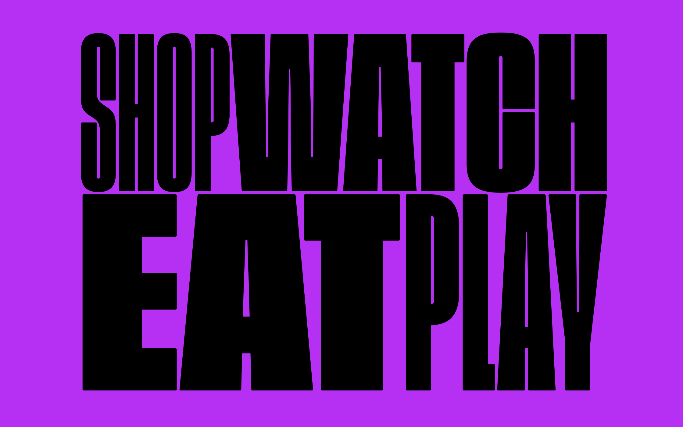

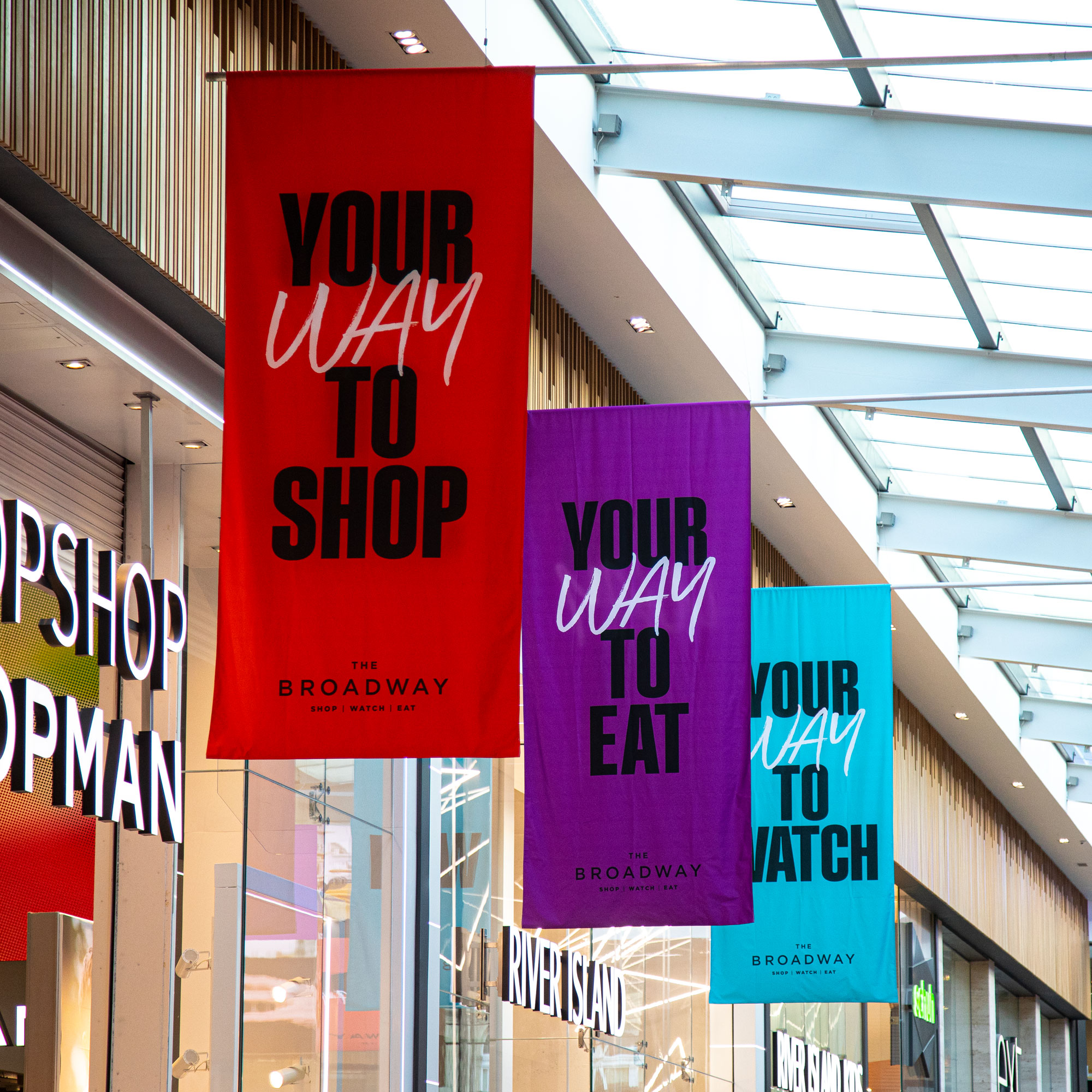
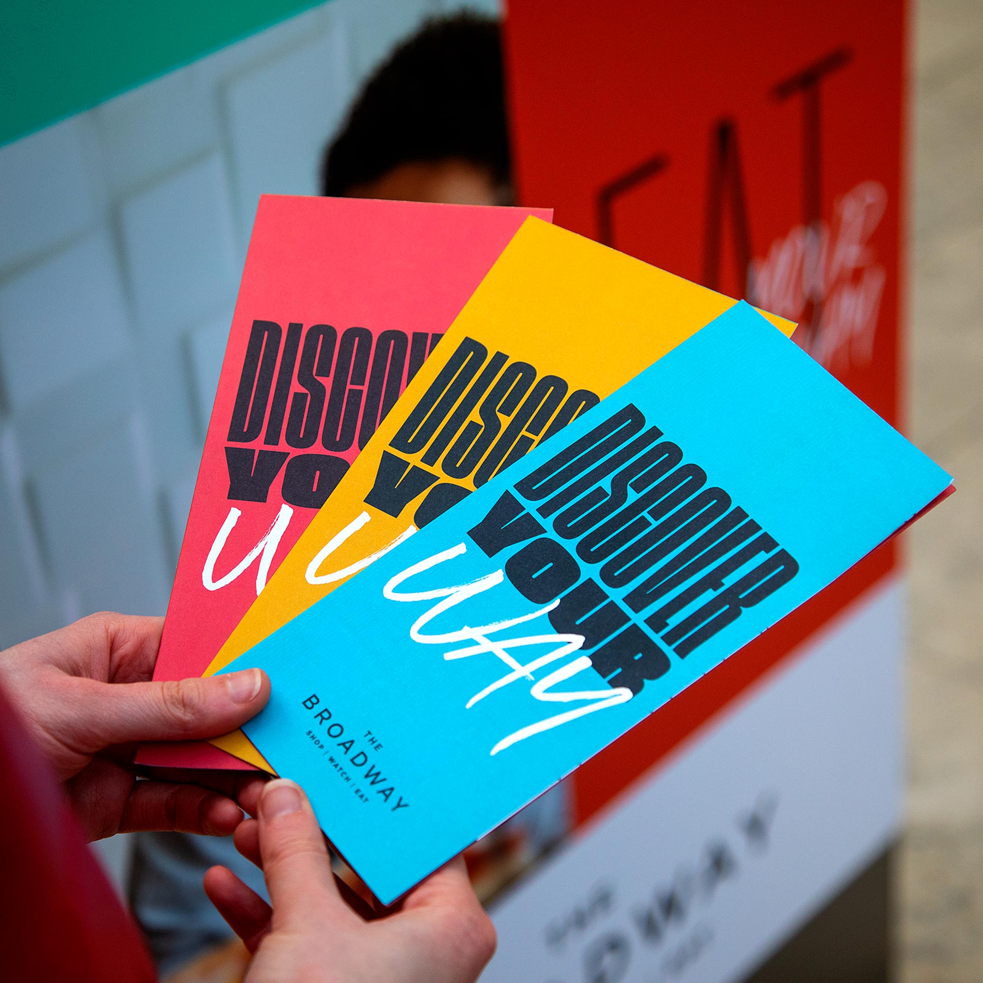
Shop. Watch. Eat.
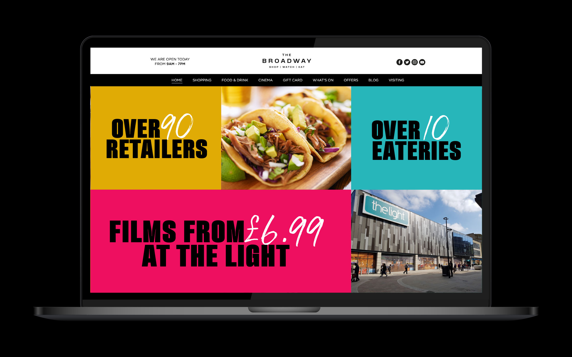
The rebrand needed to encompass the various leisure activities at The Broadway – housing over 90 retail units, a food court, a slew of restaurants and a state-of-the-art cinema. The destination was still relatively new to the city and many people from the surrounding areas were unaware of the full day retail experience on offer.
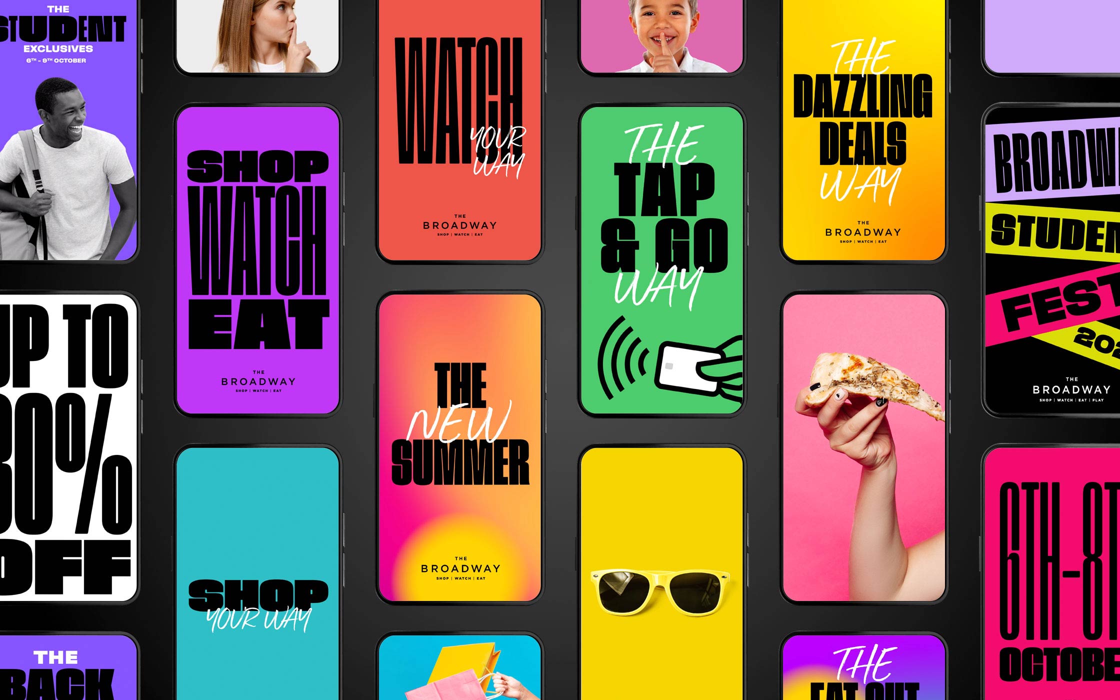
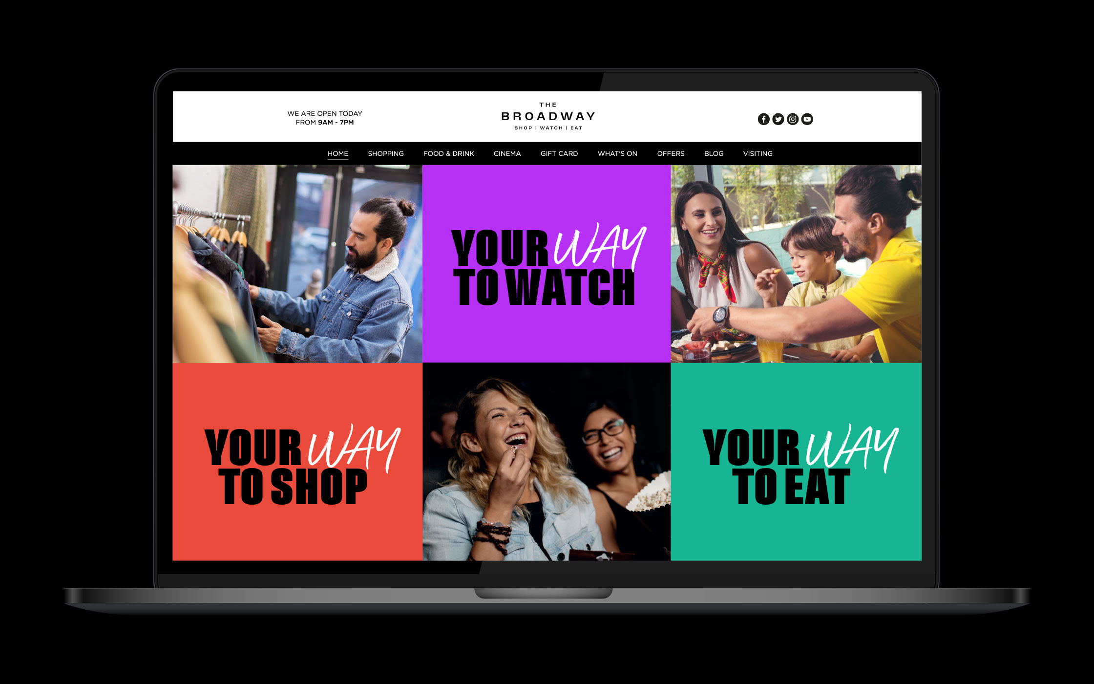
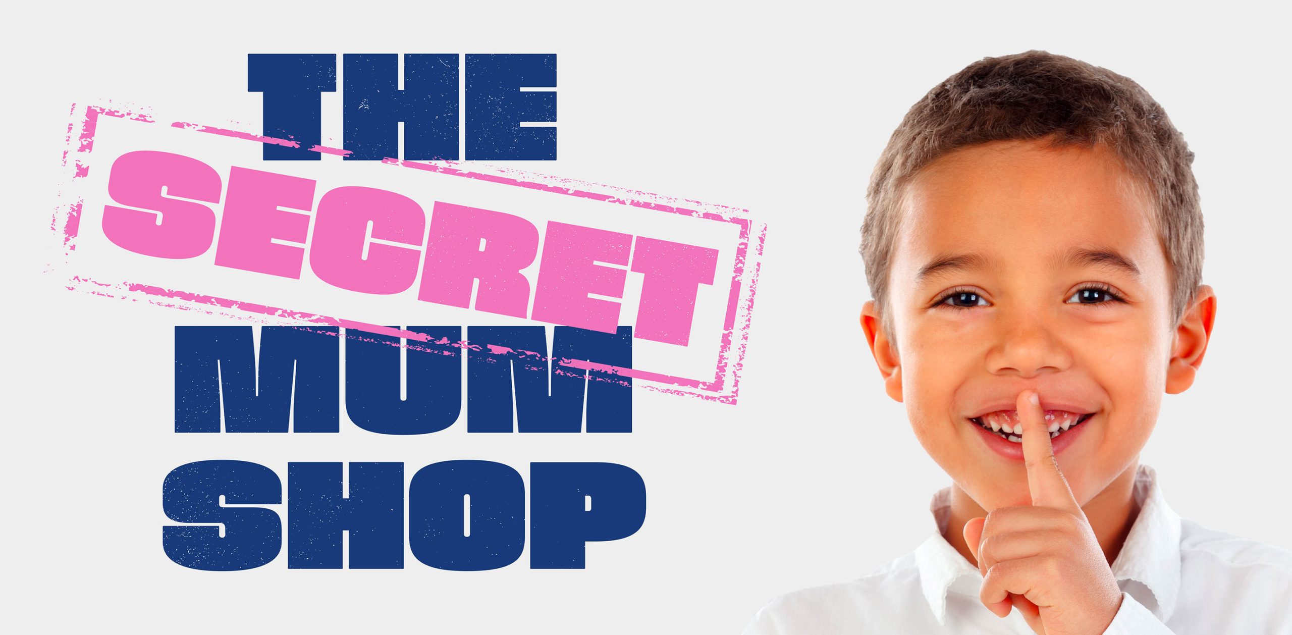
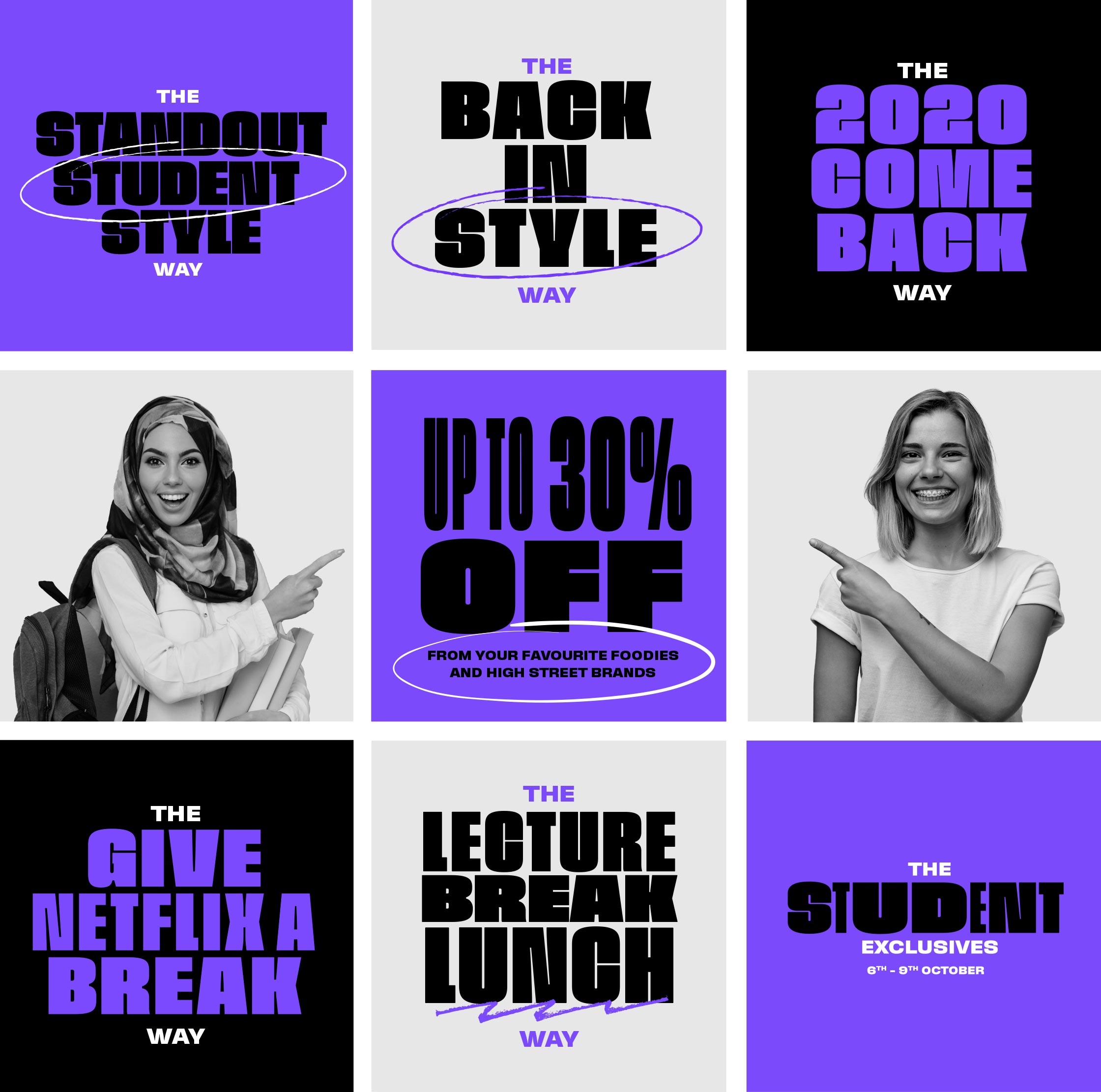
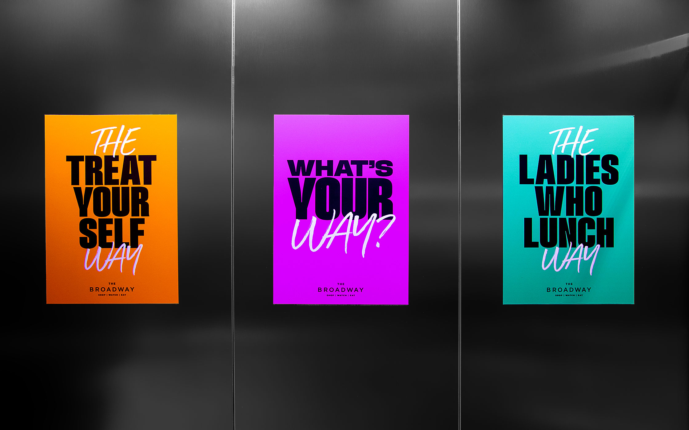
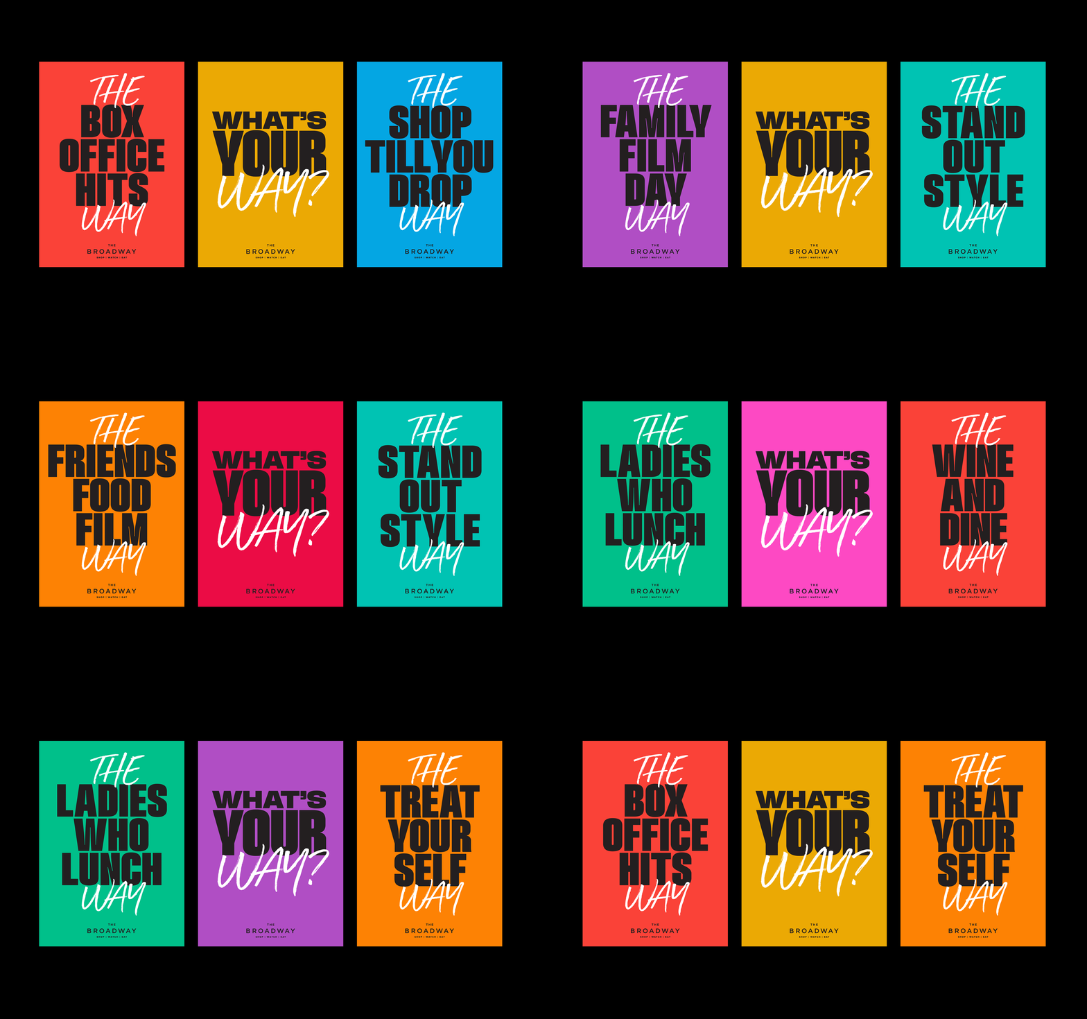
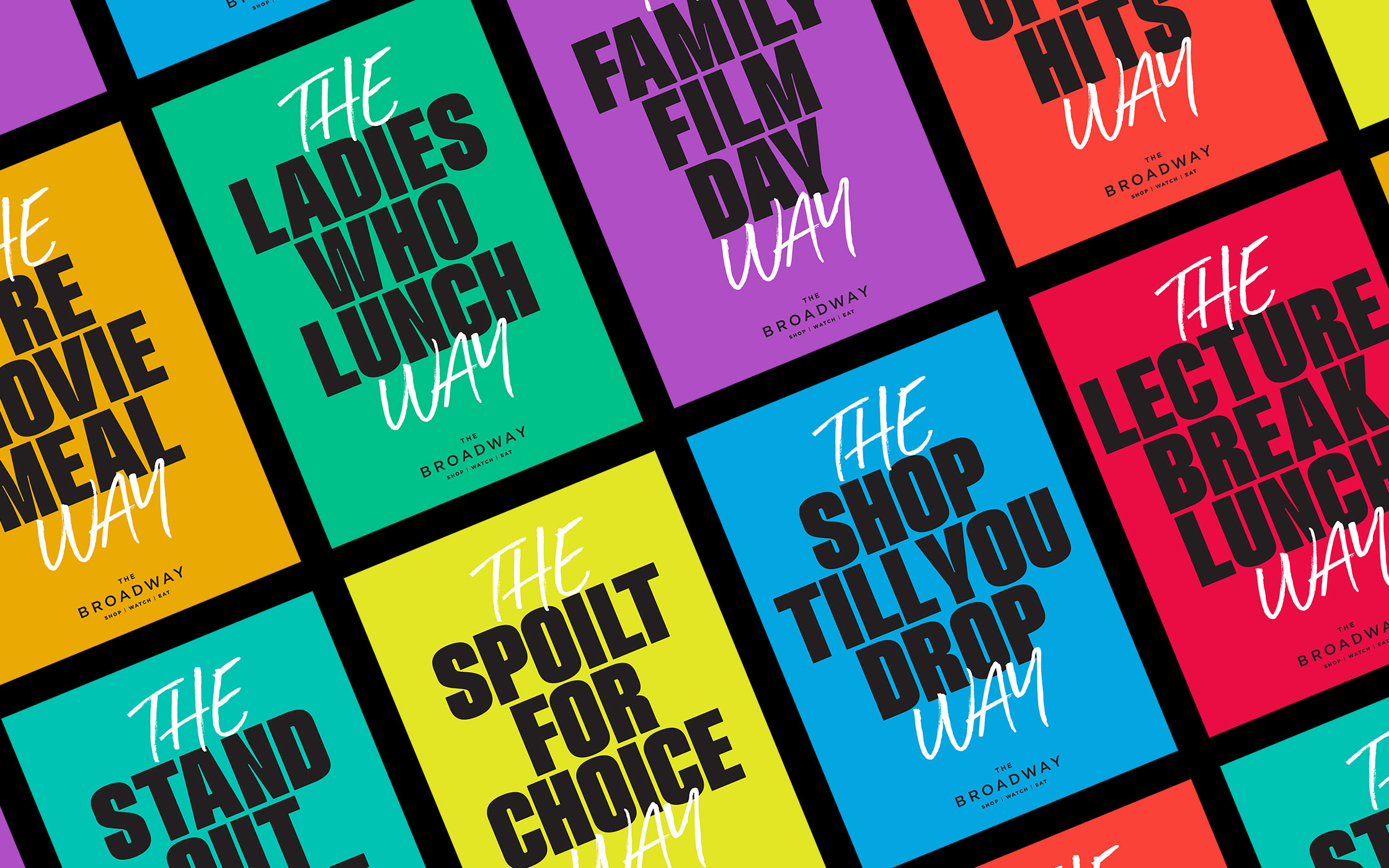
Our creative had to punch hard, stand out and help drive footfall to the centre. We built a theme around the simple statement of Shop, Watch, Eat (and later Play). Twinning this with a whole copy style that utilised ‘The Way’ from the wordmark, we crafted a whole brand language that tells a story of the experiences to be had such as ‘The Family Film Day Way’.
The revamp of The Broadway included every bit of marketing imaginable for a retail space – such as large banners, door graphics, lift vinyls, floor vinyls, way finding, maps, literature, light boxes, adverts, buses, digital billboards…… all with a coherent, recognisable and contemporary brand.
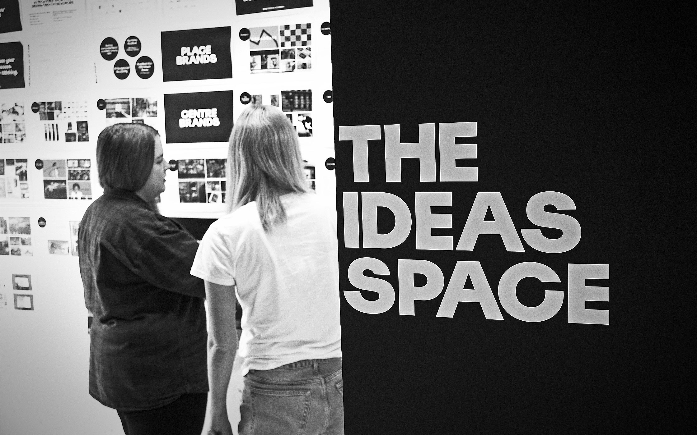




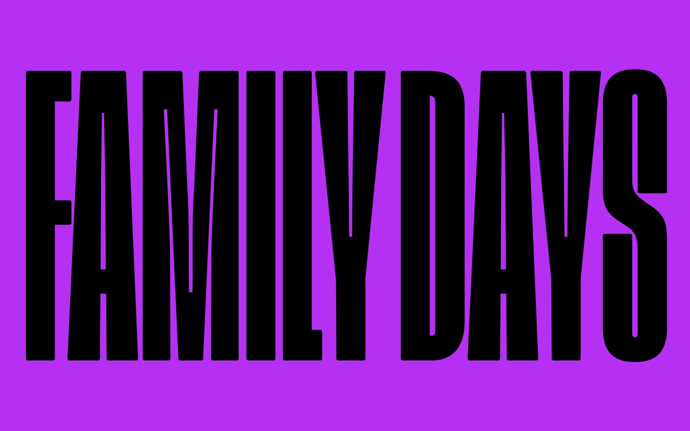
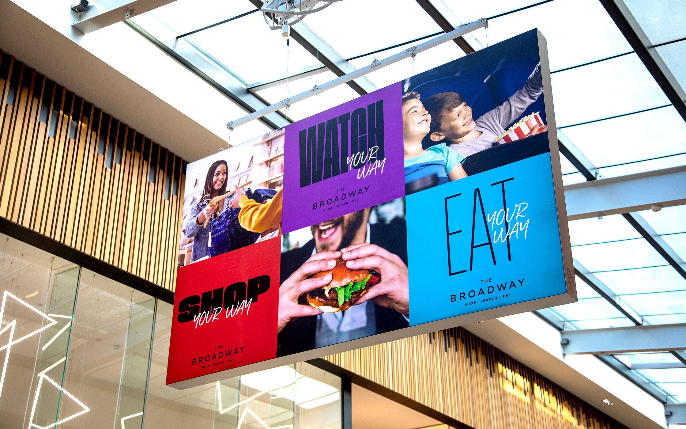
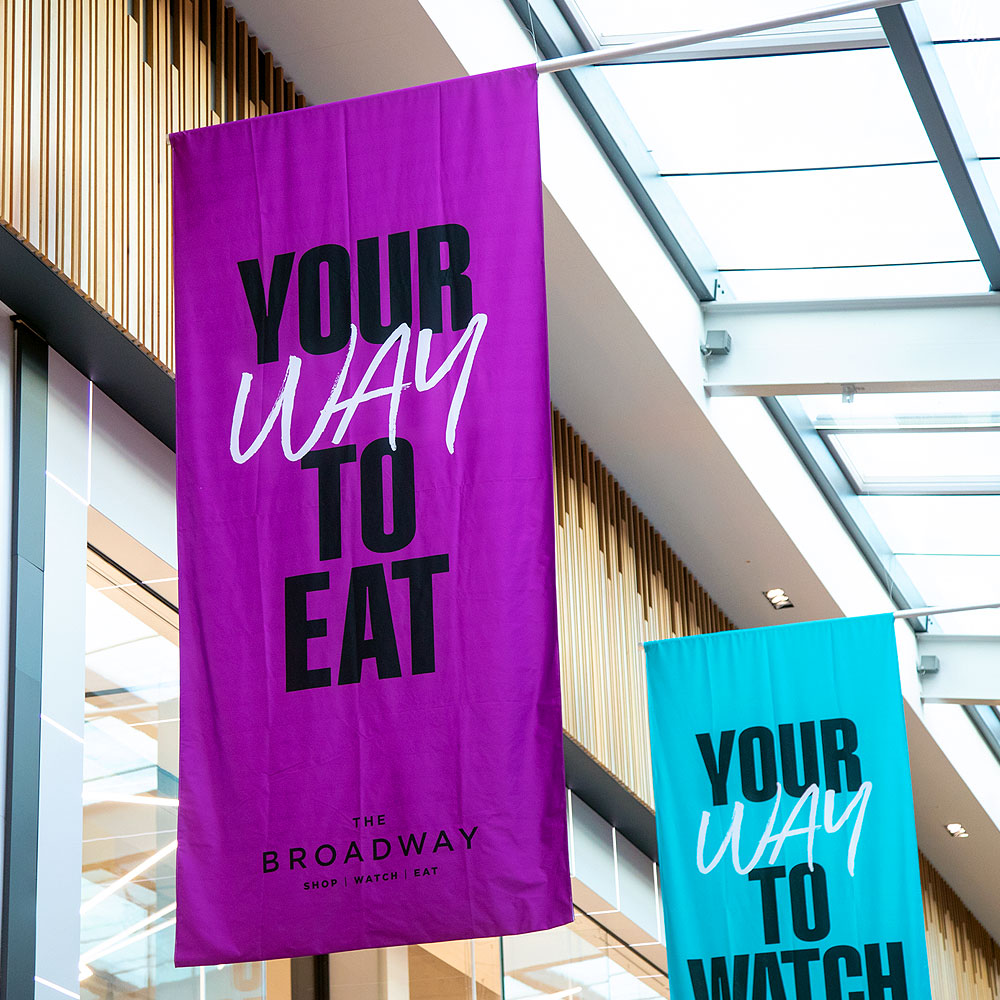

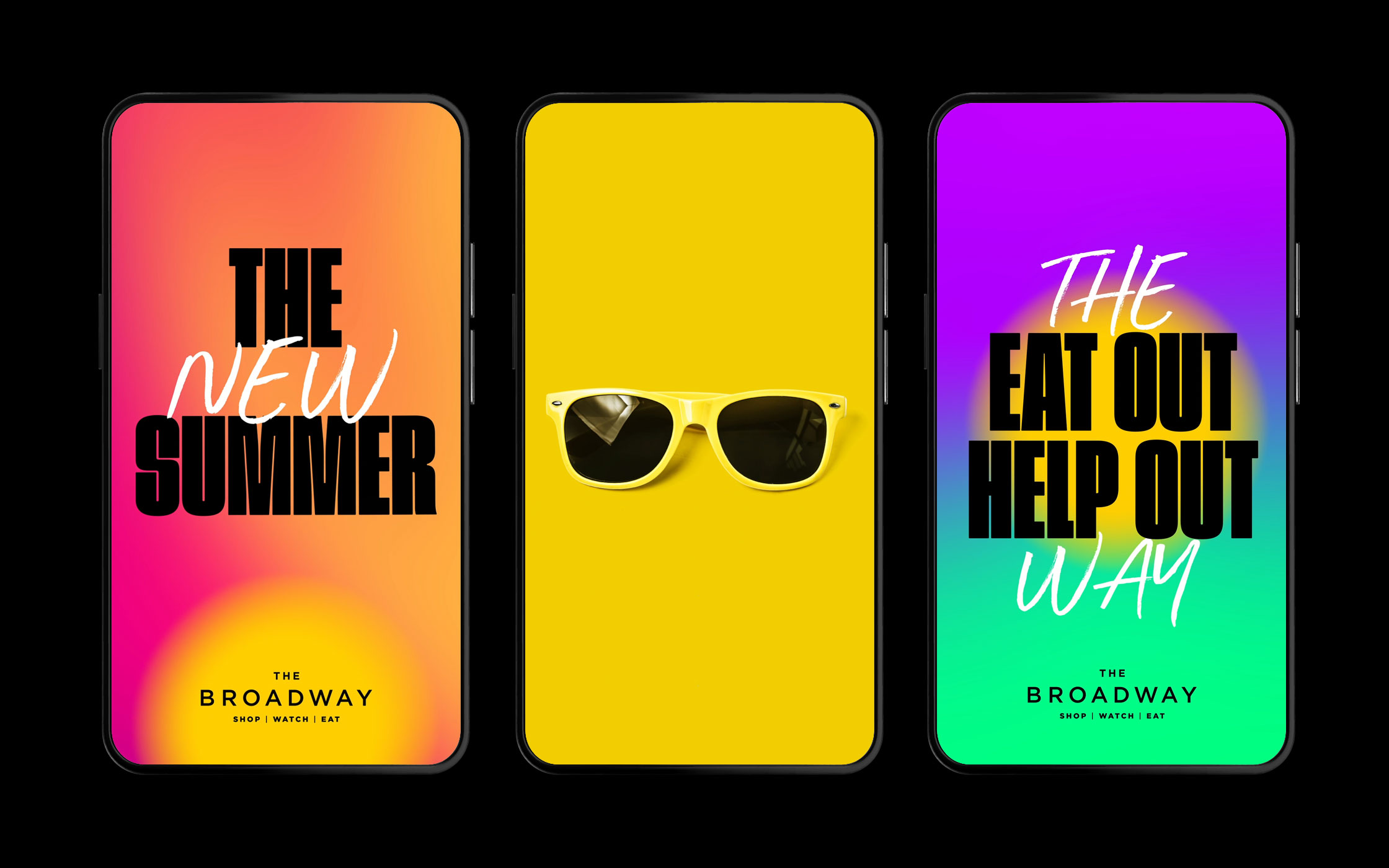
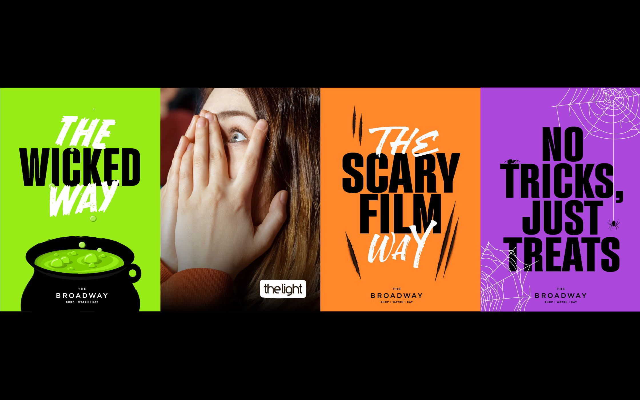
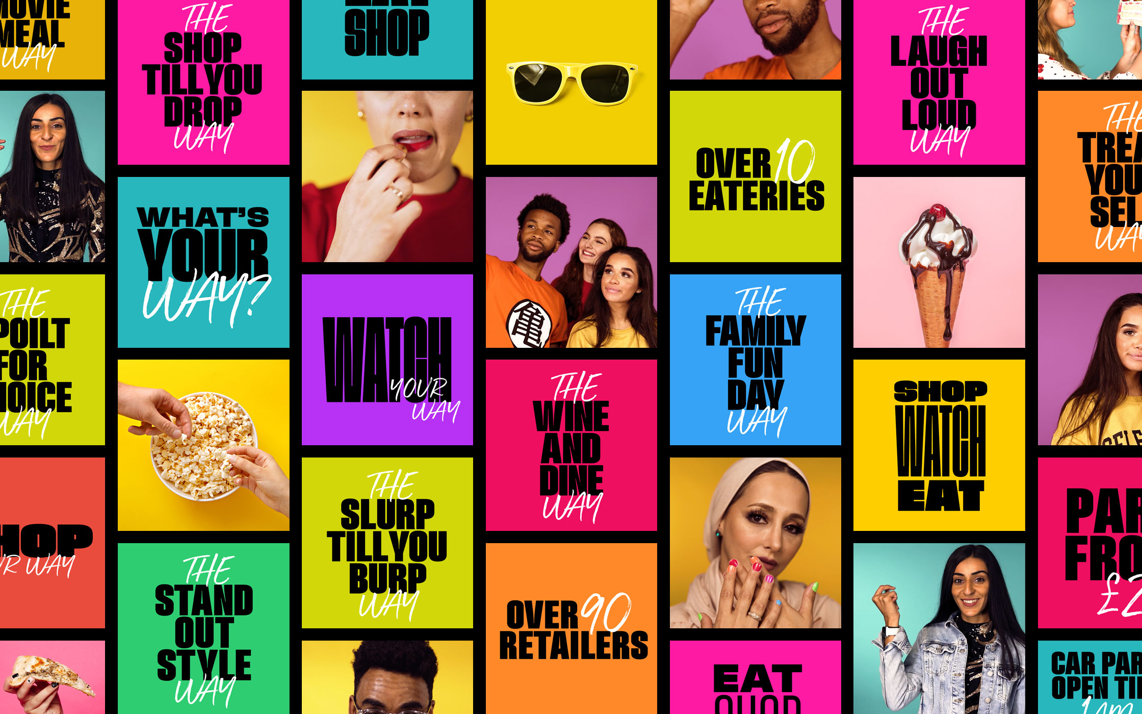
From Valentine’s Day to Boxing Day
With a never-ending calendar of seasonal campaigns to create, the brand had to be flexible and malleable, while still retaining a recognisable core that was unmistakeable as The Broadway.
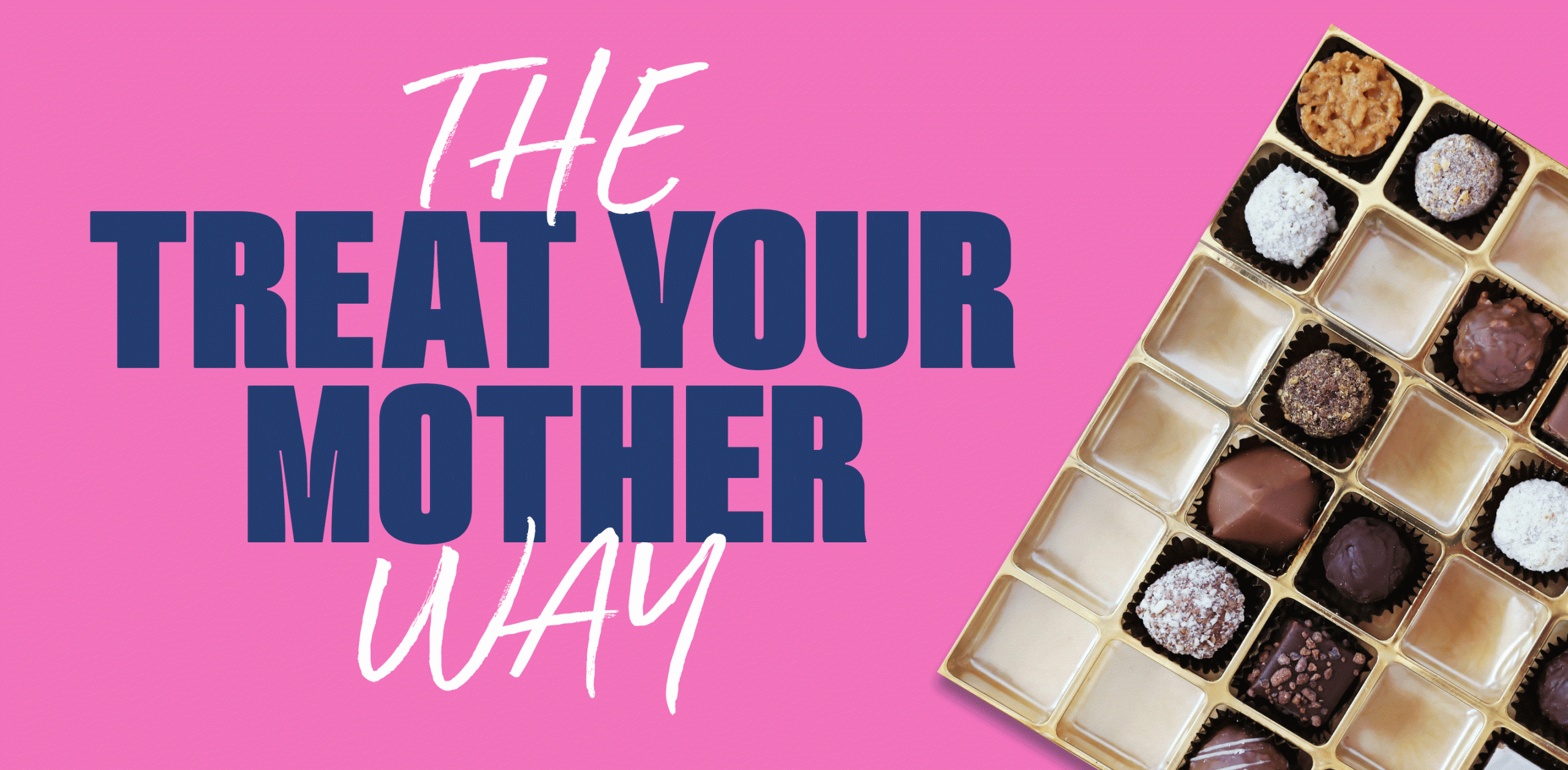
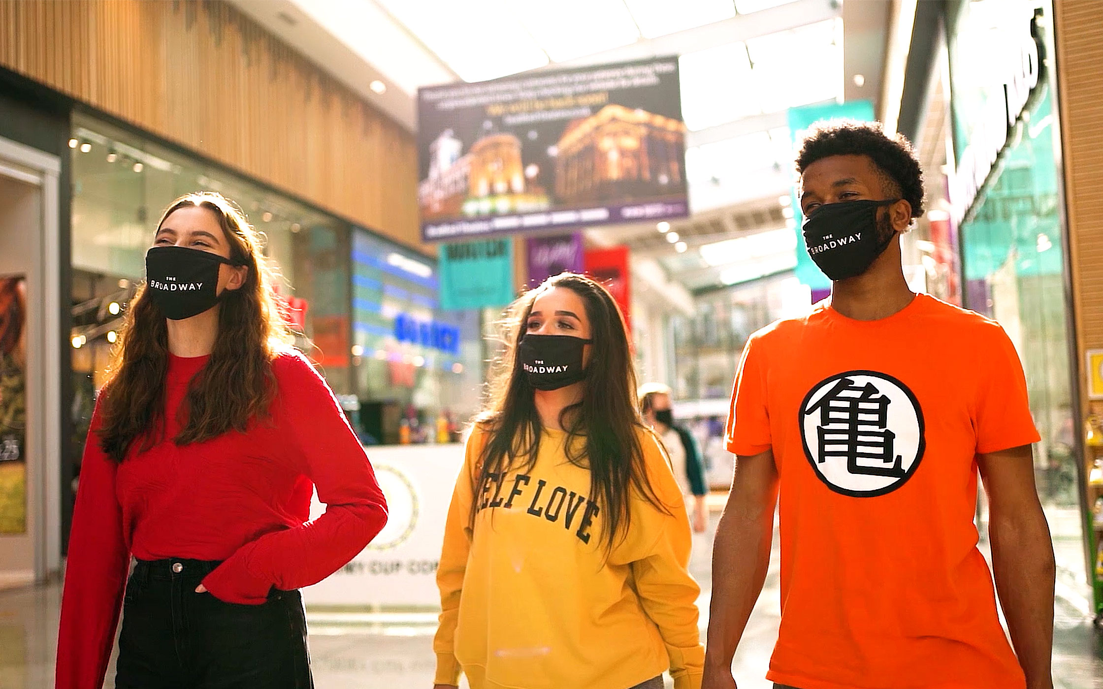
Our choice of typeface gave us a heart to the campaigns, and our plethora of colours gave us lots of scope. The copytone worked its way through everything and even through covid lockdowns, with retail having to close its doors to all but essential shops, we’ve given The Broadway brand a big dose of energy and life. From Mother’s Day to Halloween, from Summer to Winter, from social to store.

