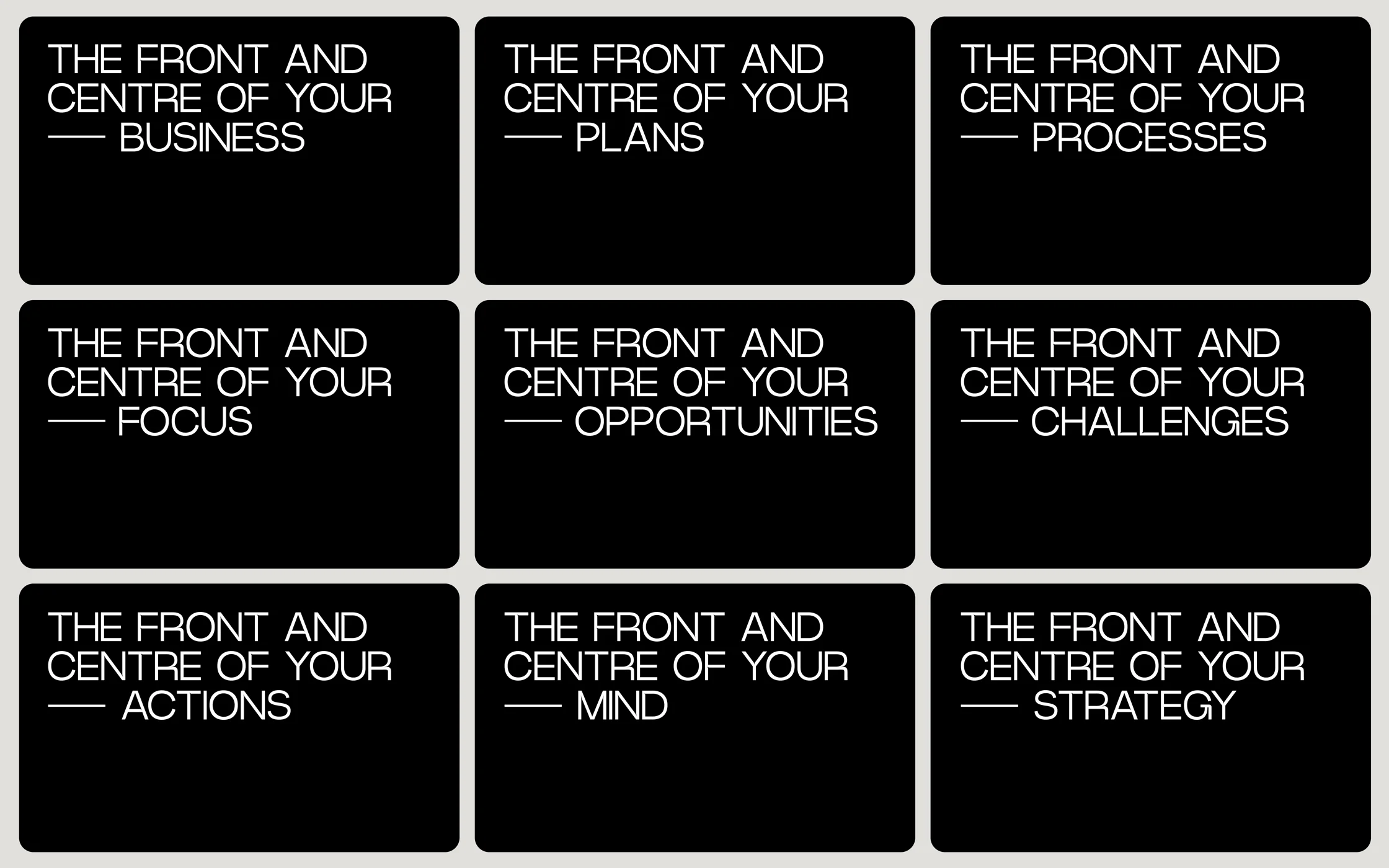
When your client named KAMguru says “I hate the word guru and nobody knows what KAM means”, well you’ve got yourself a branding problem. Founder and front man David Ventura needed someone to get inside his head. He knew his name and brand didn’t work anymore, the focus on KAM (Key Account Management) had become too niche as he trained and coached on everything from leadership through to sales. We ran an intense set of branding workshops with the self-confessed ‘neurospicy’ founder and we uncovered something. Whatever the client’s issue was, David and his team always kept the issue front and centre of their programme, from leaders without followers to customer care that isn’t very caring. Front&Centre® was born. The brand that puts your key pain point or opportunity front and centre.
NAME | BRAND STRATEGY | BRAND | COPYWRITING | WEB | SOCIAL | PRODUCTISATION


The previous name ‘KAMguru’ was a cheeky little pun, but David’s clients didn’t always know what it meant as KAM is a niche subject. Our task was to create something completely new, an authority brand in his sector and the key objective from, David was to ‘compartmentalise what we do into a unified language world, around sub-services and models’. Work that one out…
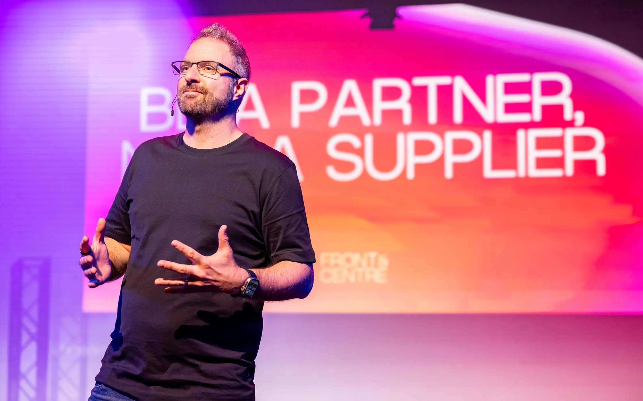
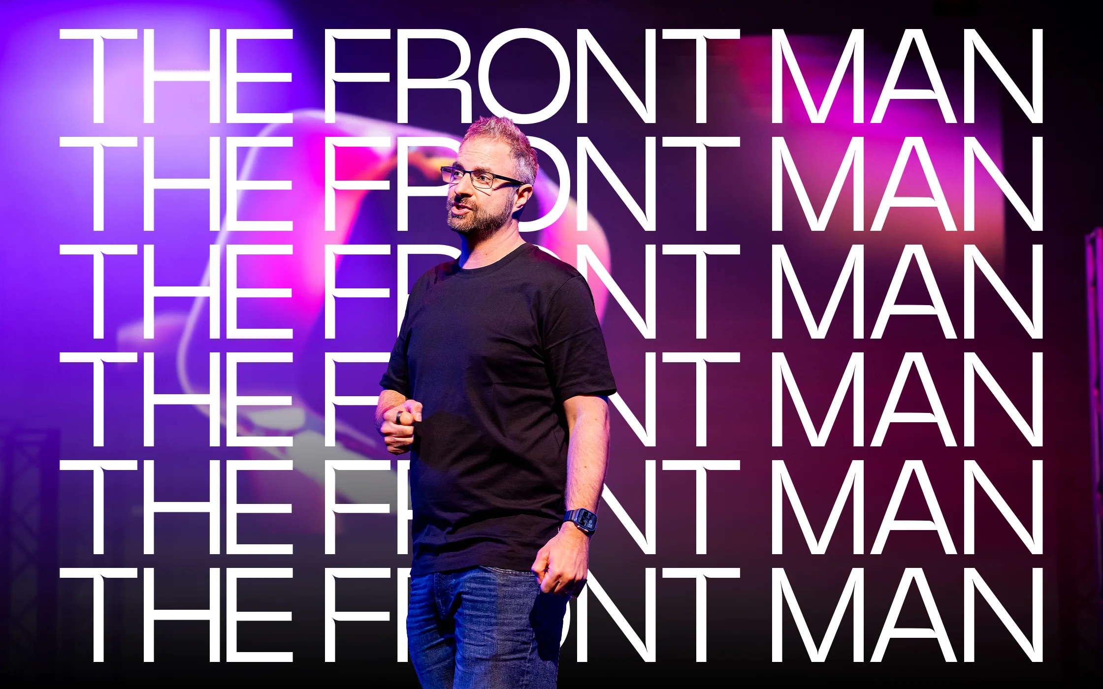
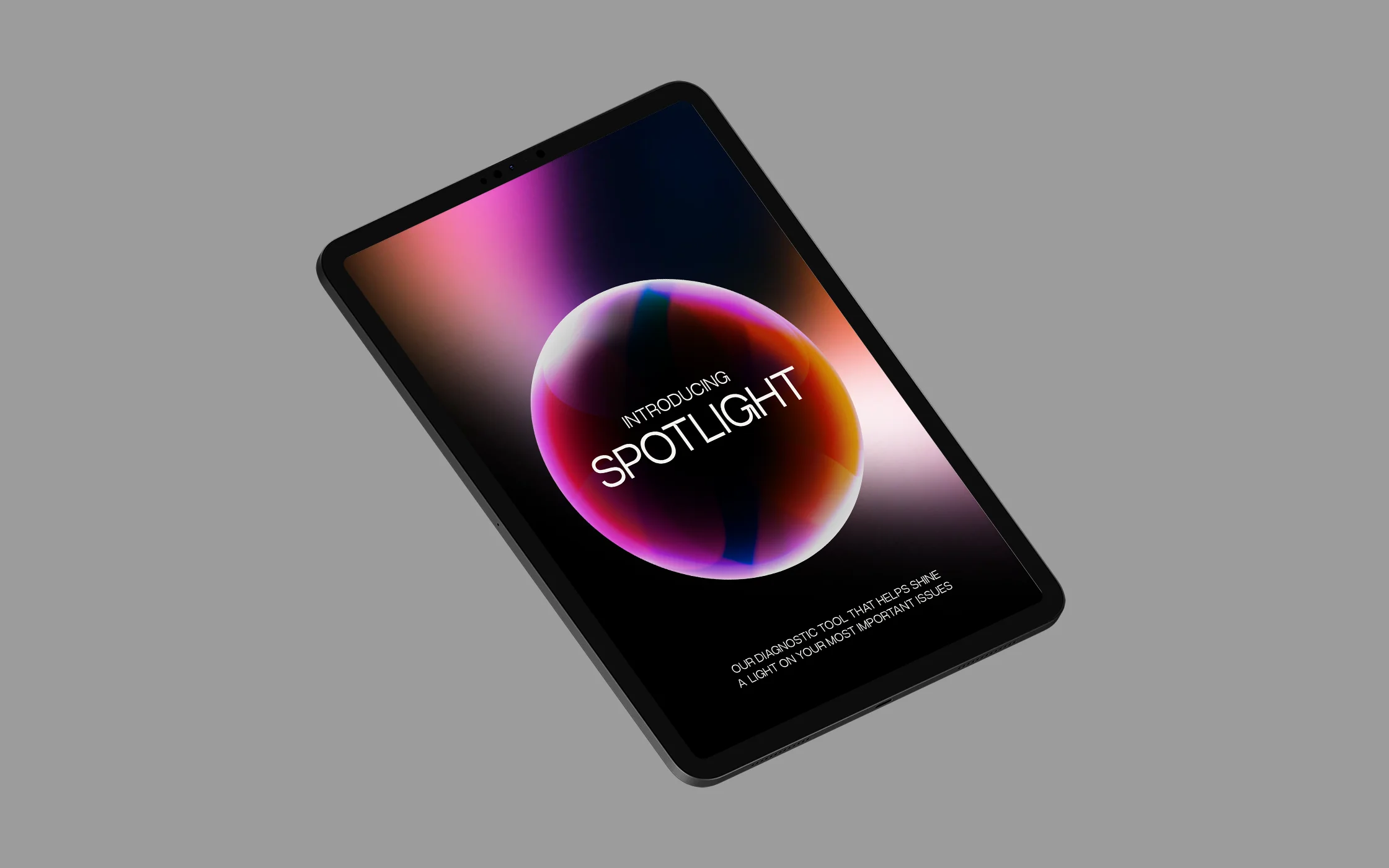
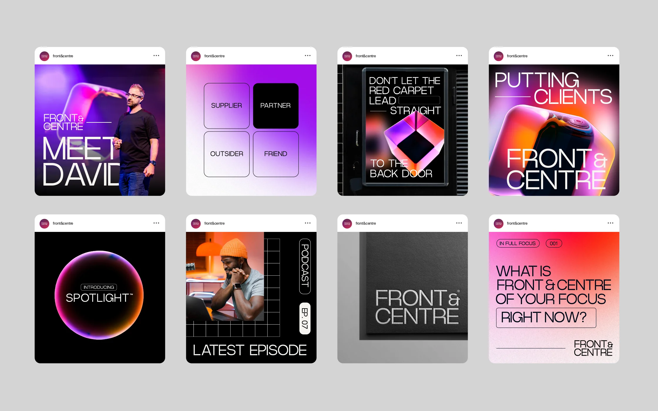
After many hours and hundreds of ideas, we struck upon Front&Centre, a single idea that captured what David and his company do. This idea expanded into an entire ‘unified language world’ and lit up the eyes of our client. From naming David ‘the front man’ to creating diagnostics called ‘Spotlight’ the brand world had begun.


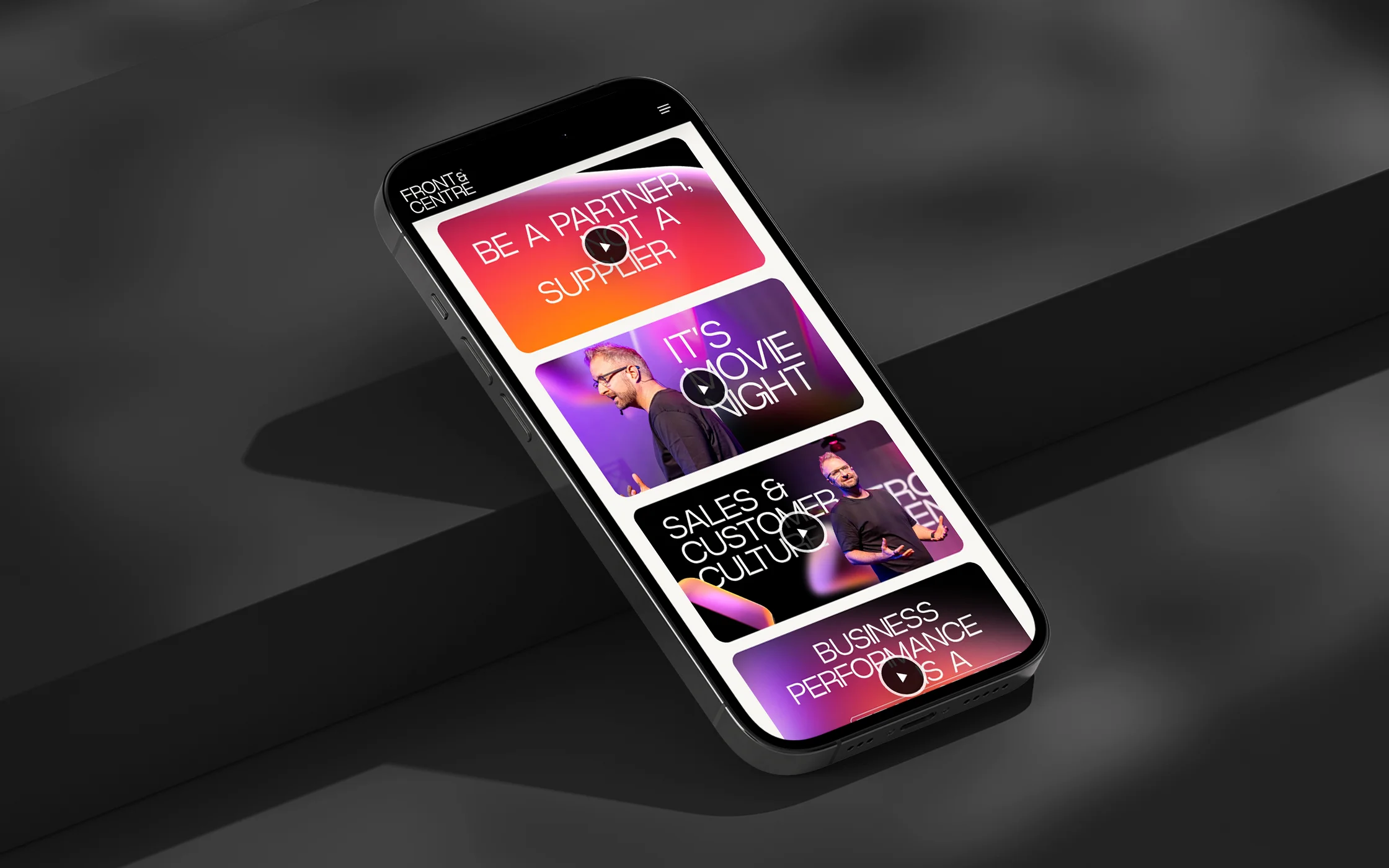
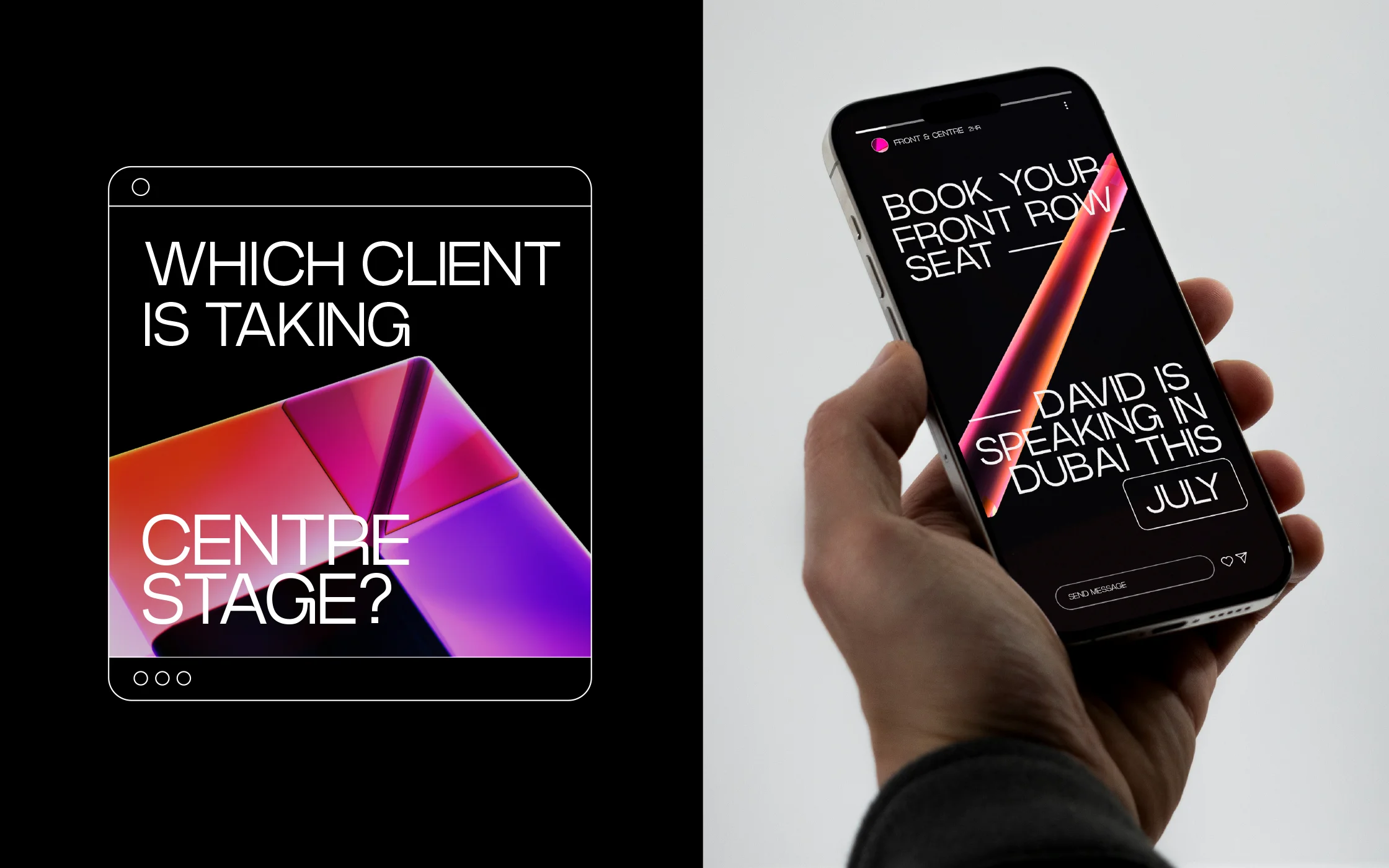
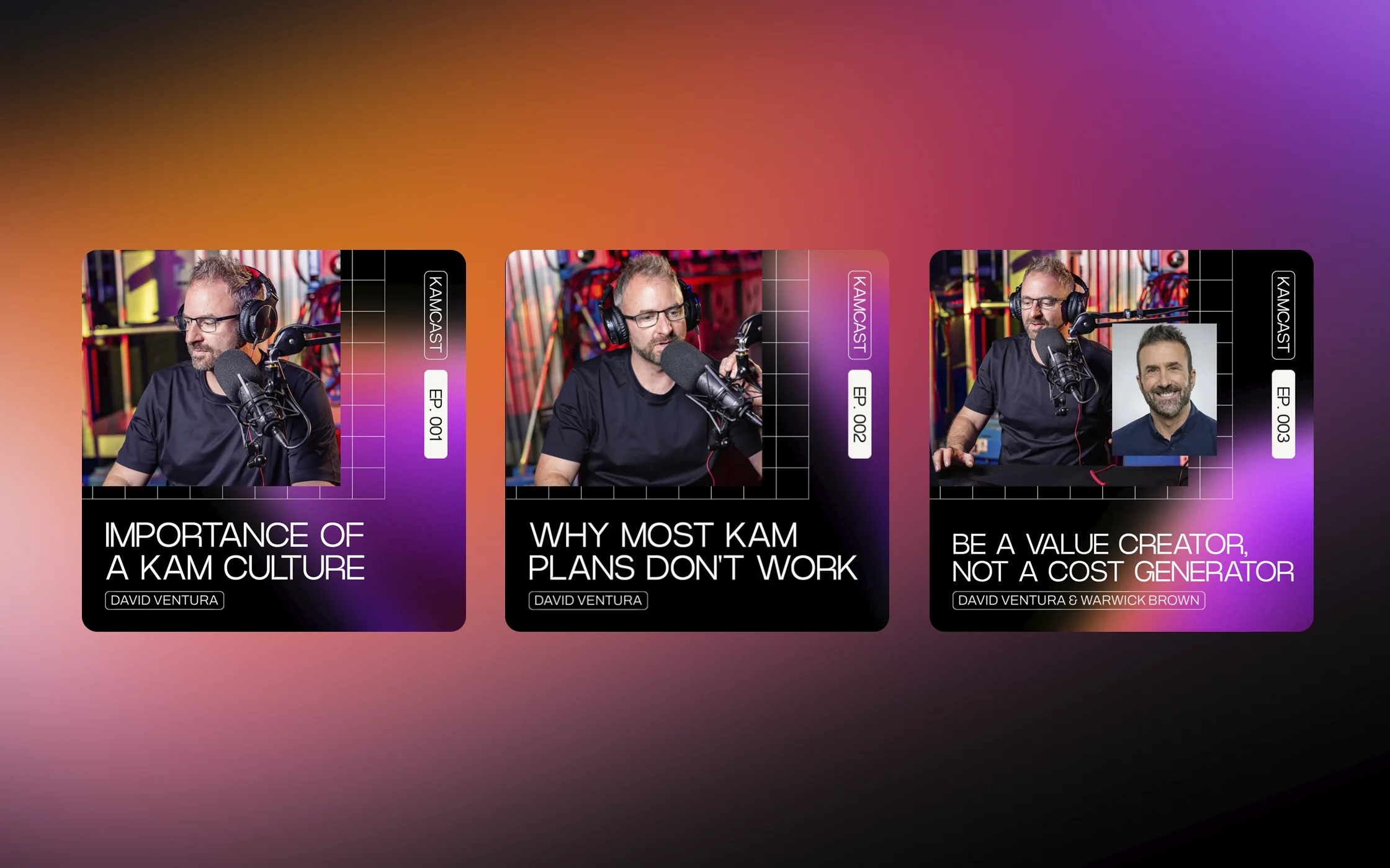
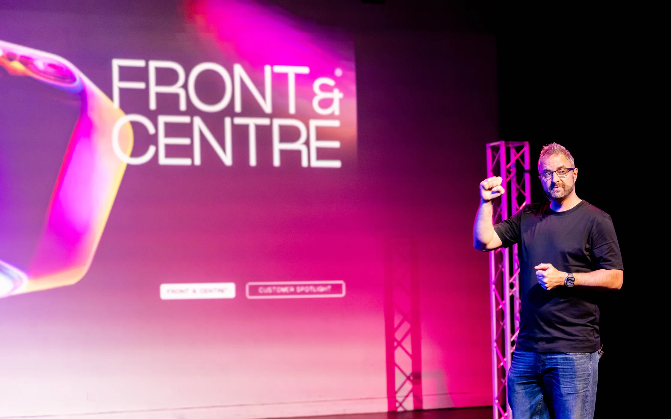
When your client trademarks the word ‘neurospicy’ and confesses that he loves the stage, the spotlight and performing, it’s a chance to build a brand world around their passion and purpose. Front&Centre was the perfect chance to do this – creating a persona for David and his speaking, shooting new content, creating a photography style, building a whole set of brand assets and using David’s spicy ‘phrases’ wherever we could.

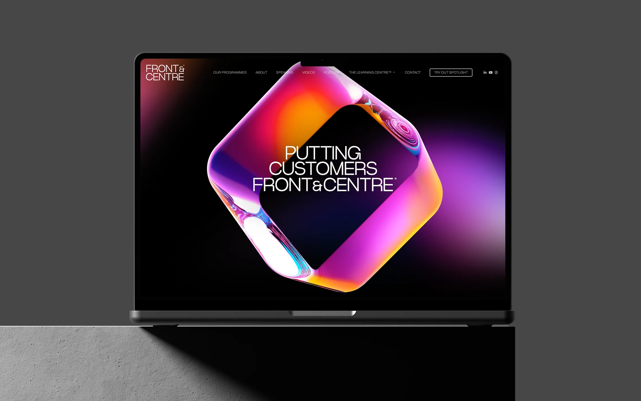


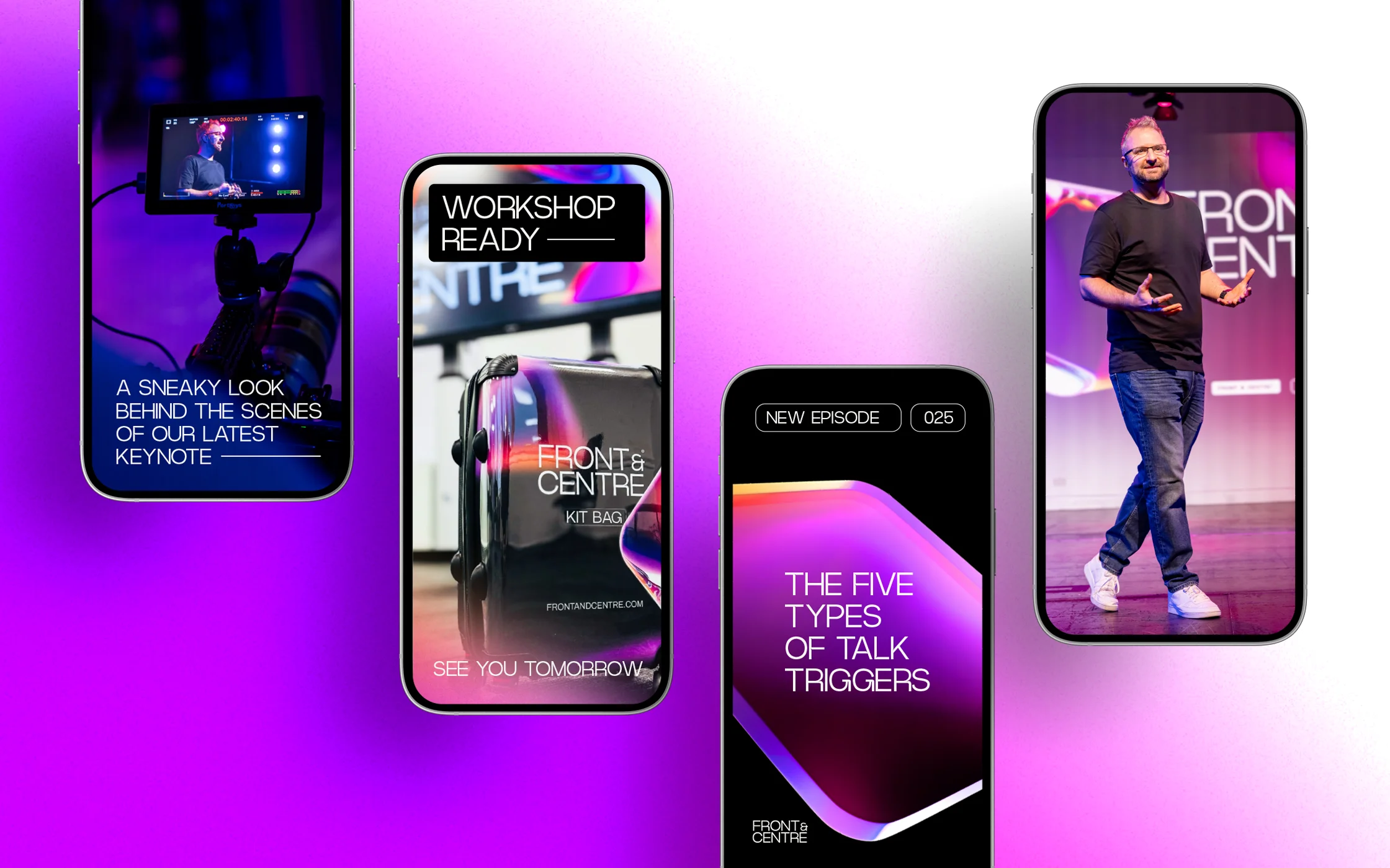
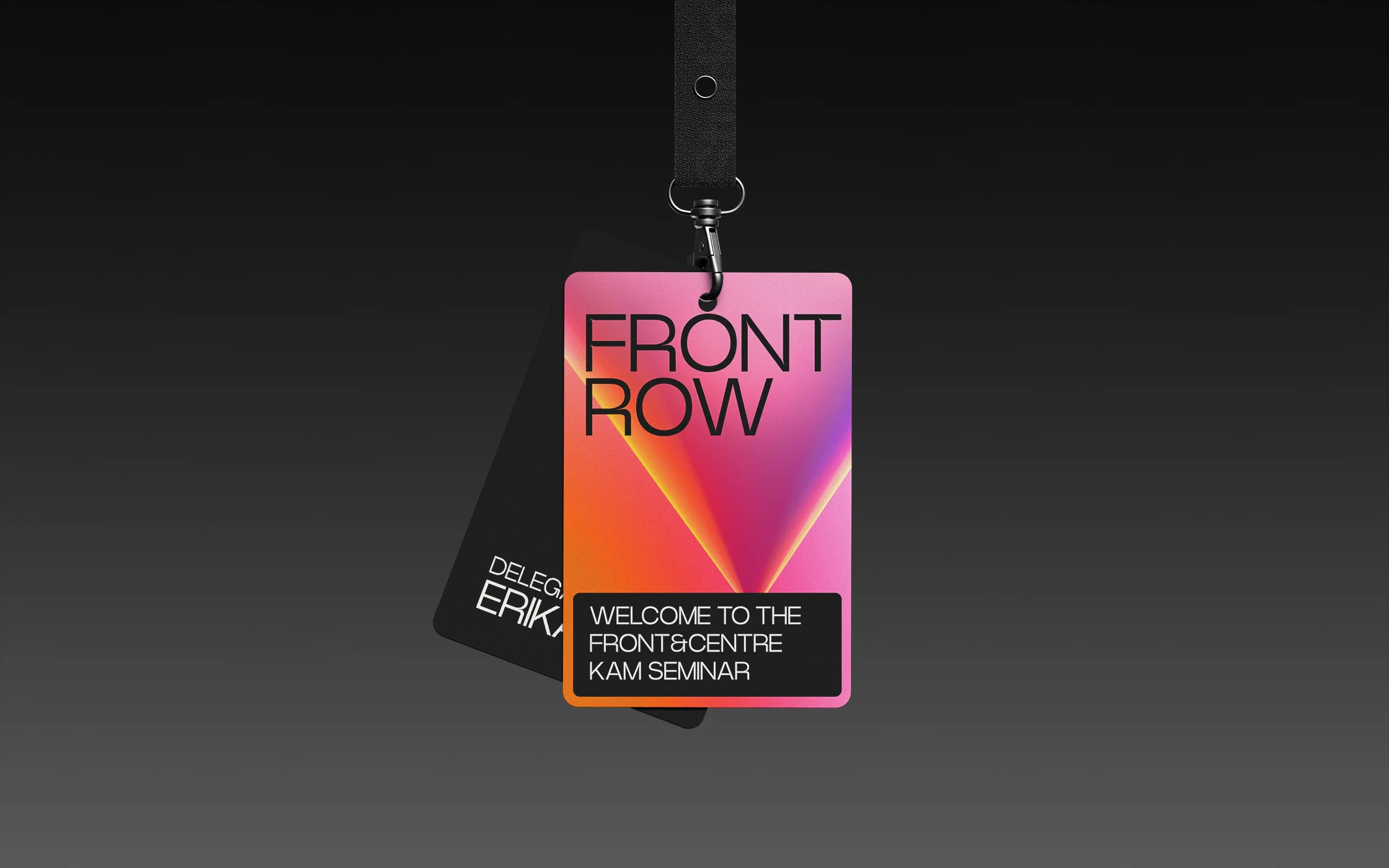
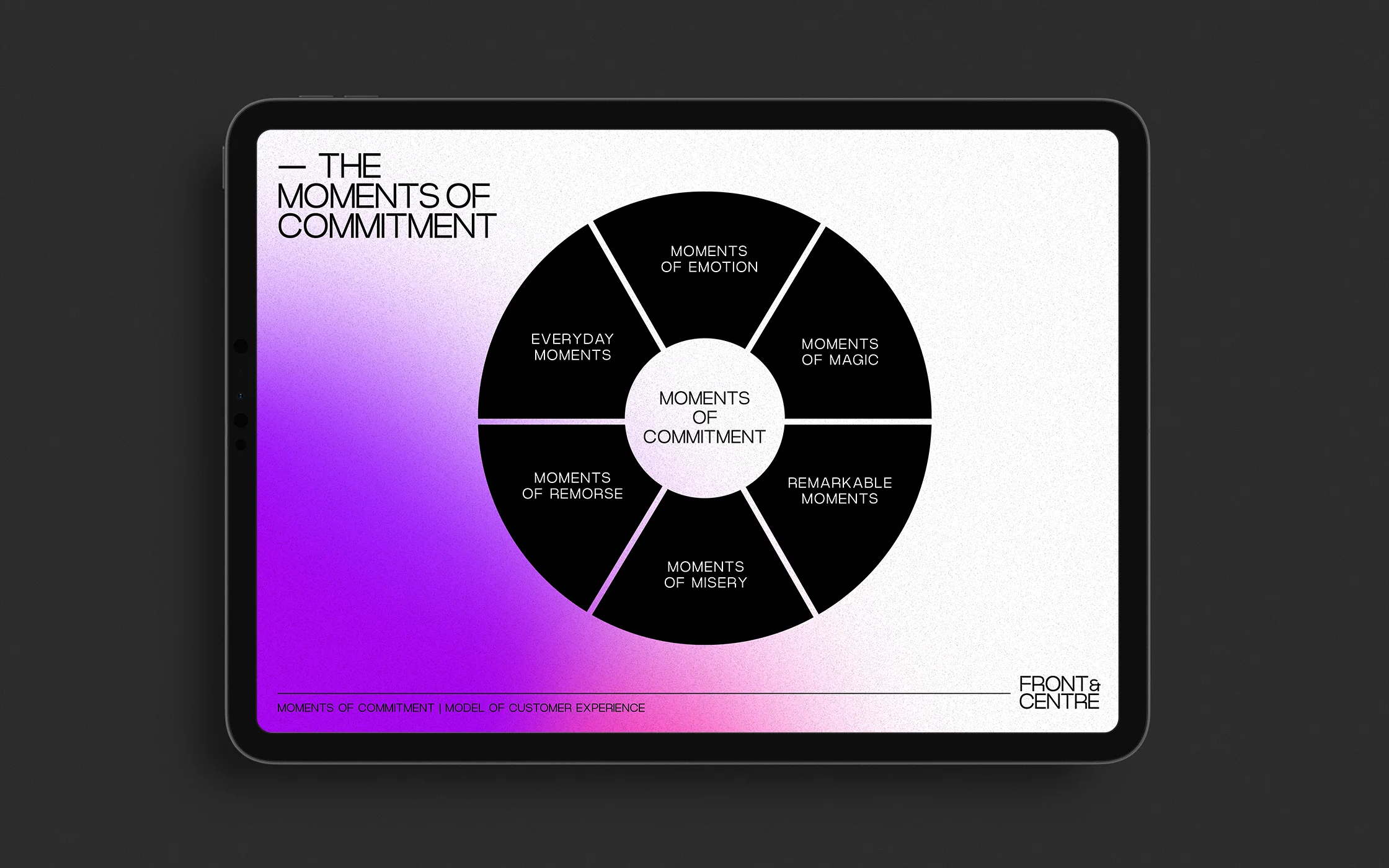
At the heart of the brand are a set of beautiful 3D shapes – full of colour, depth and intrigue and used throughout the brand world to give the company a recognisable look and feel. From presentation slides to lanyards, from cases and bags to digital, the shapes are there to move in and out of typography, giving a visual representation of topics being front and centre, and less important things being blurred behind.
Armed with a new name, a new brand and a world of brand assets, Front&Centre® are taking the consultancy sector by storm, attracting clients up and down the country and speaking on stages all over the world.


“Just want to say that I’m LOVING your work and I’m LOVING this process. So energised!! I couldn’t be happier with where we are, and where we’re heading. You are INCREDIBLY talented and I’m valuing our partnership far more than I ever imagined. You have something very special at ALLGOOD and I am drawn to it like a moth to a flame!”
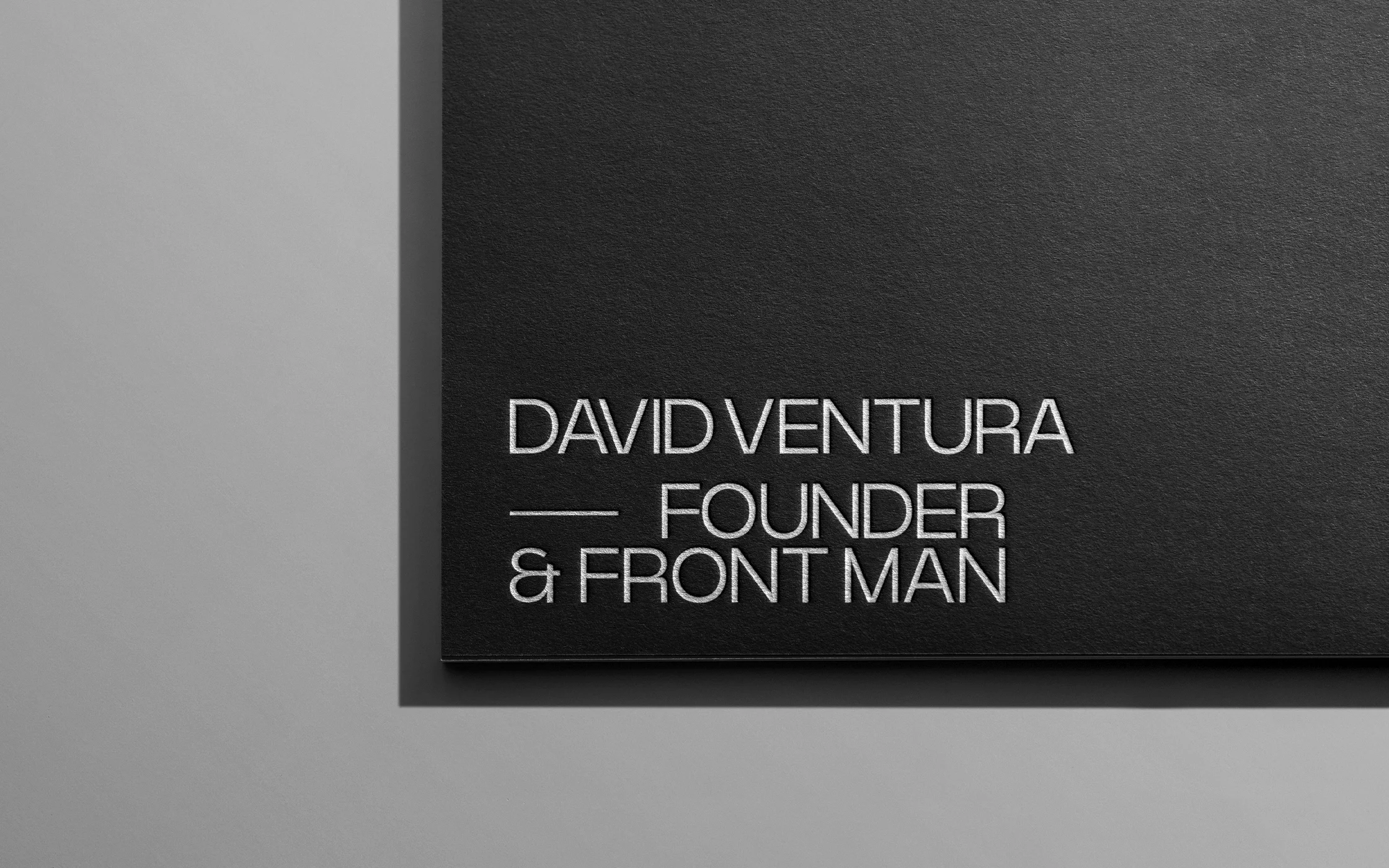
David Ventura
Founder and Front Man
Front&Centre®