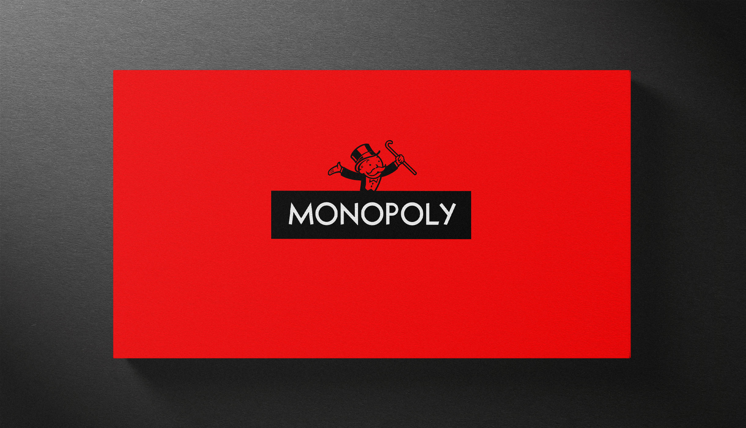
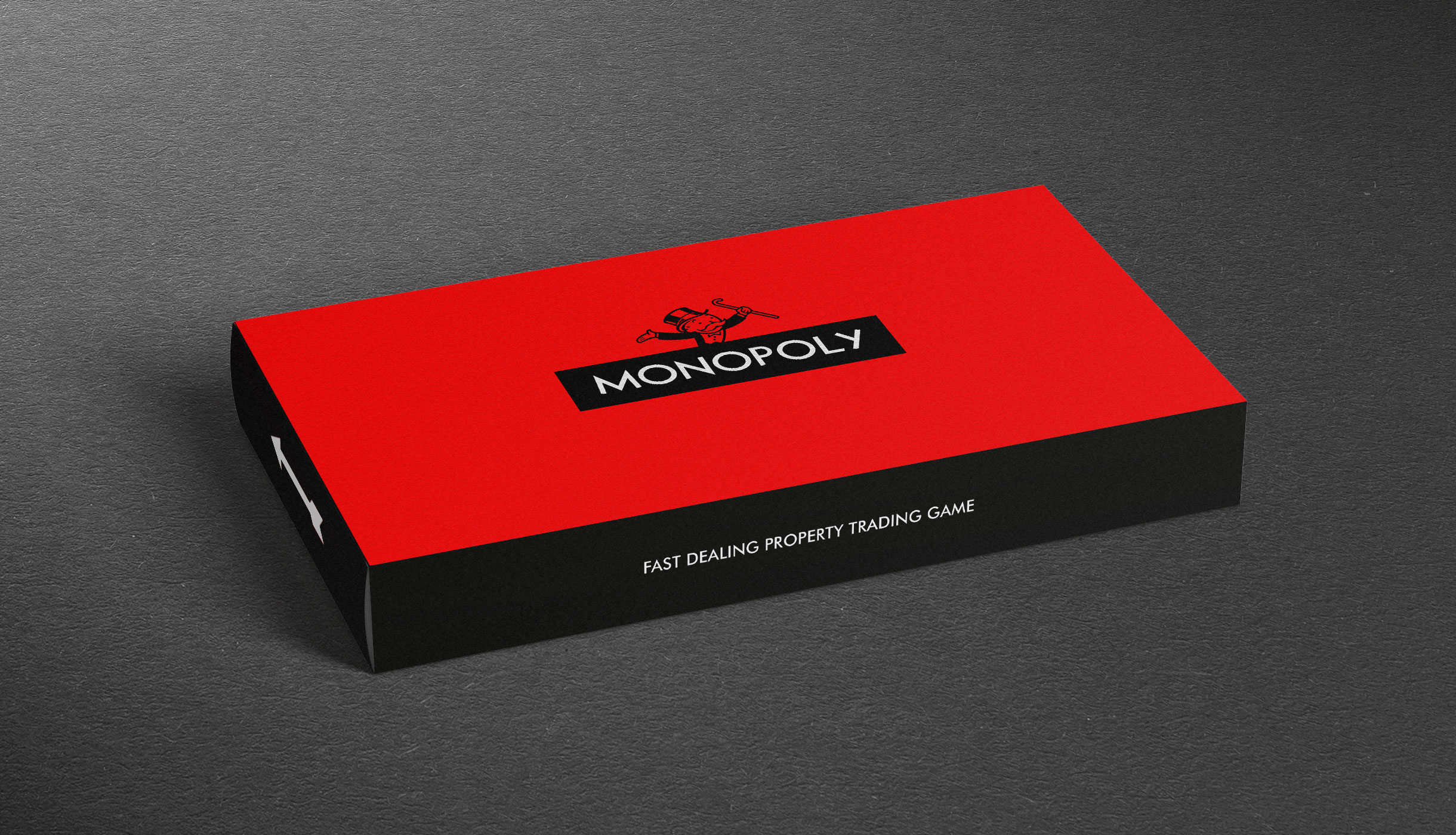
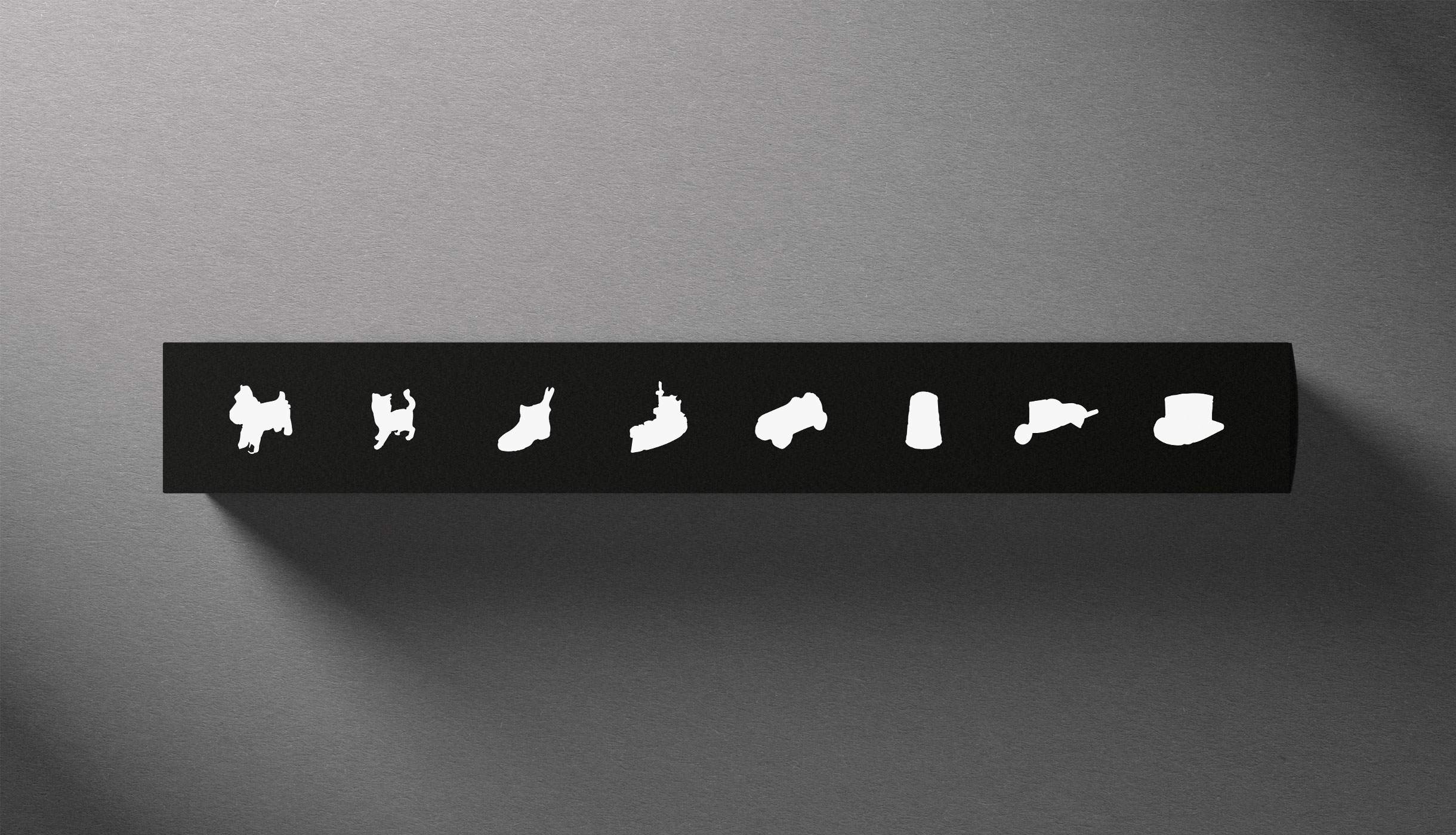
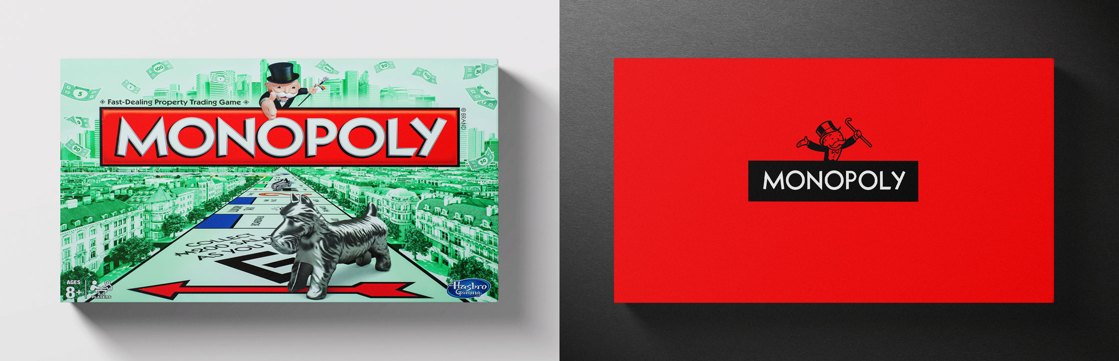
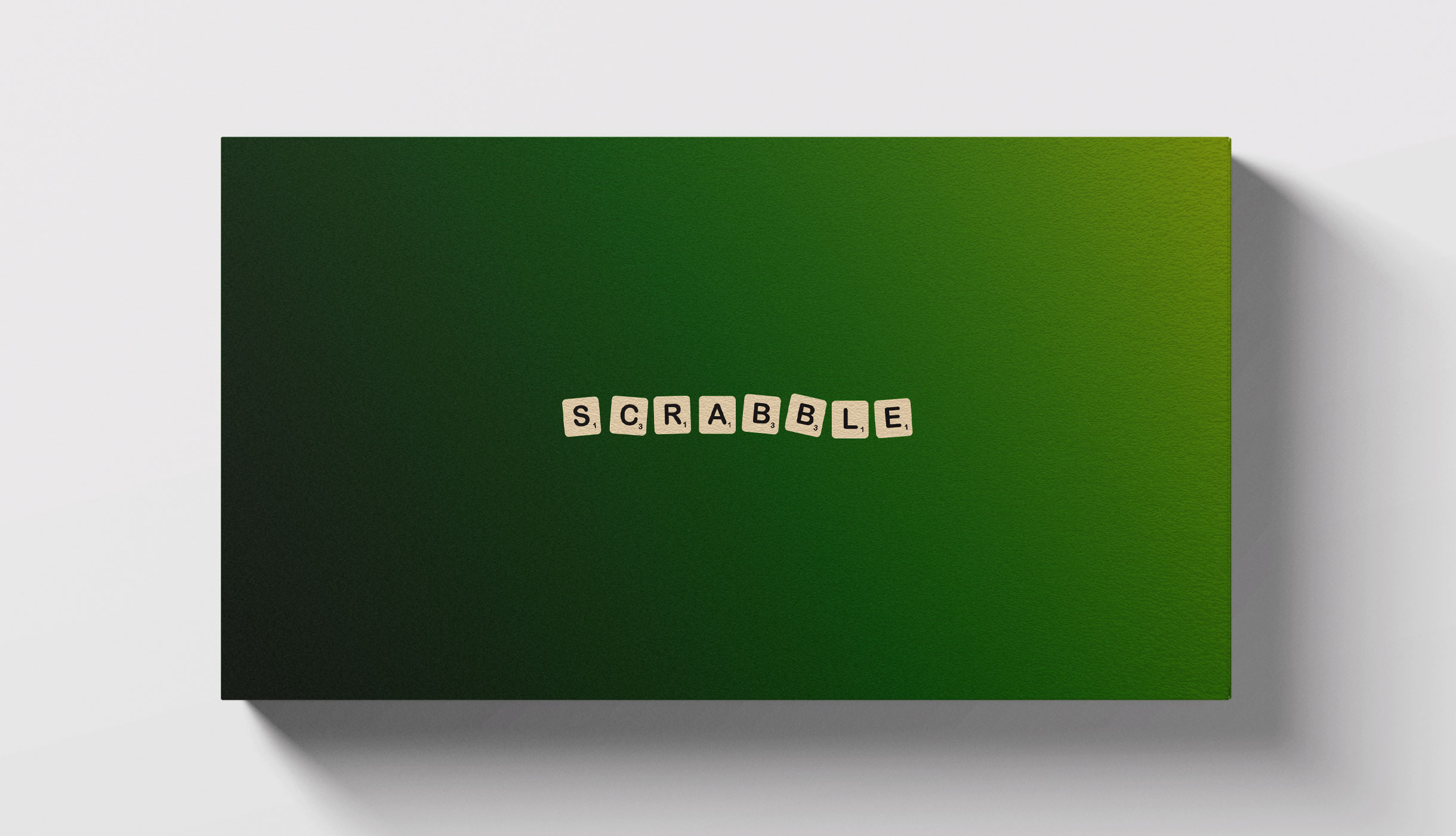
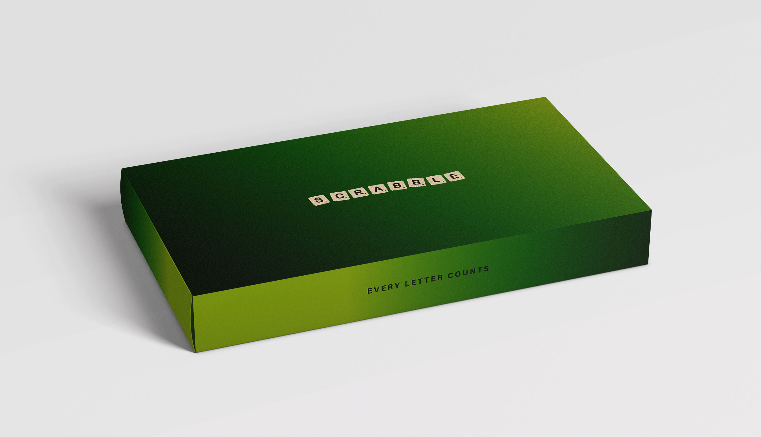
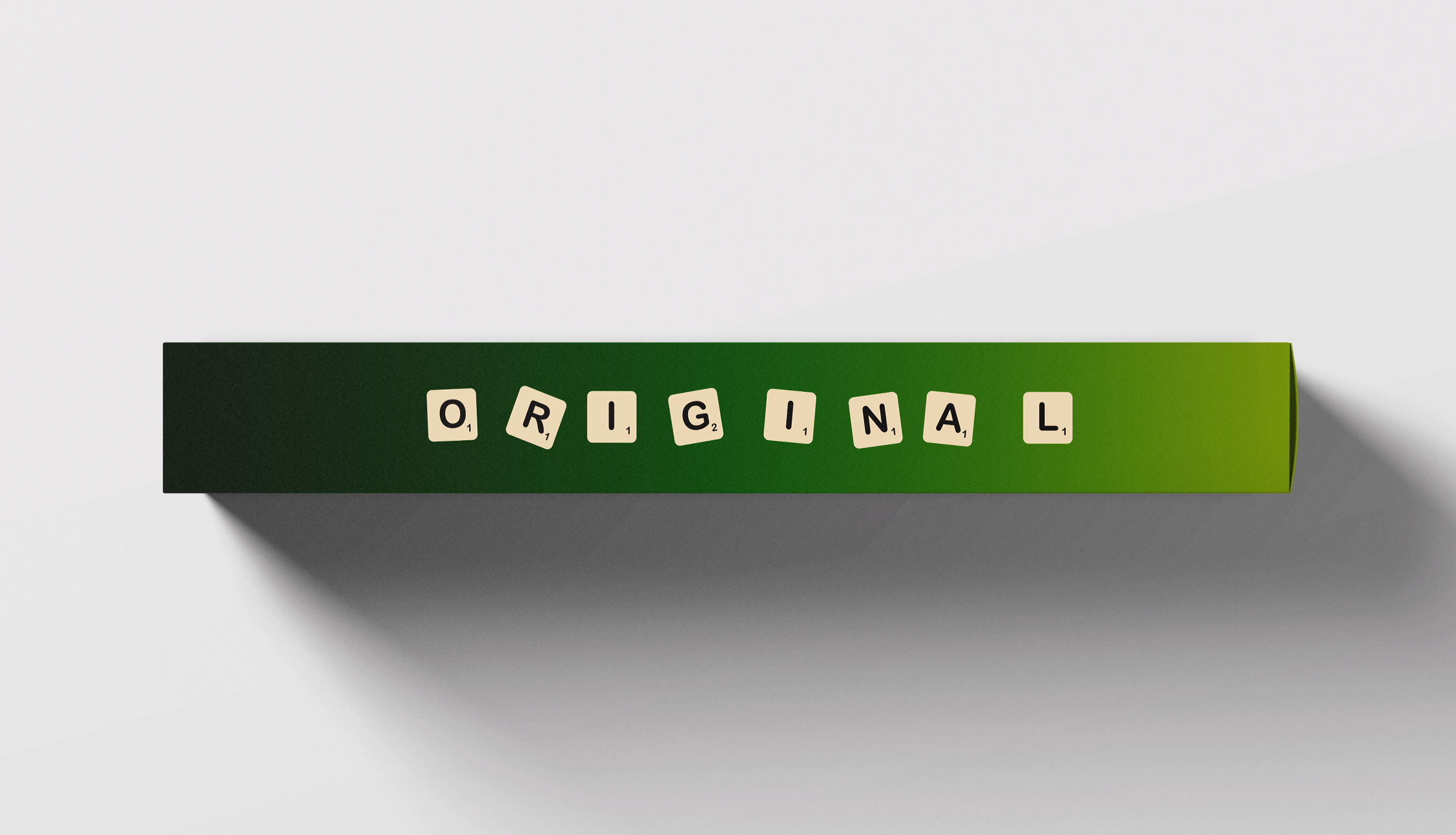
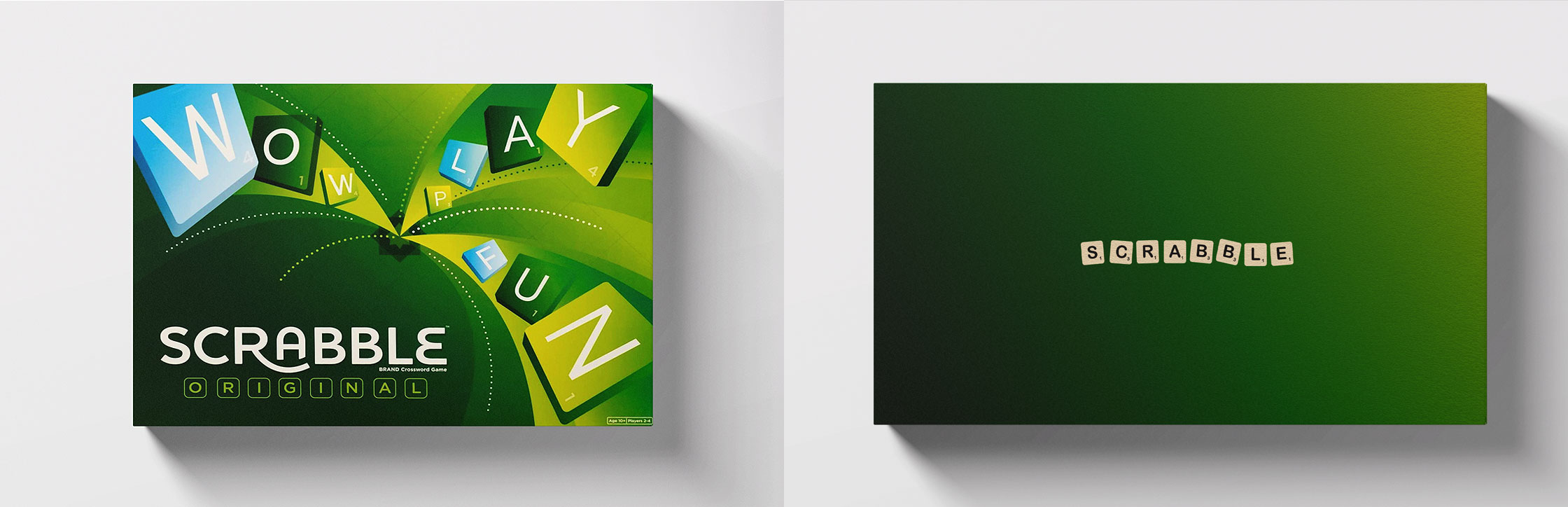
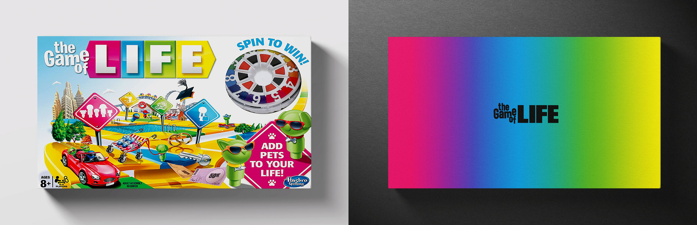
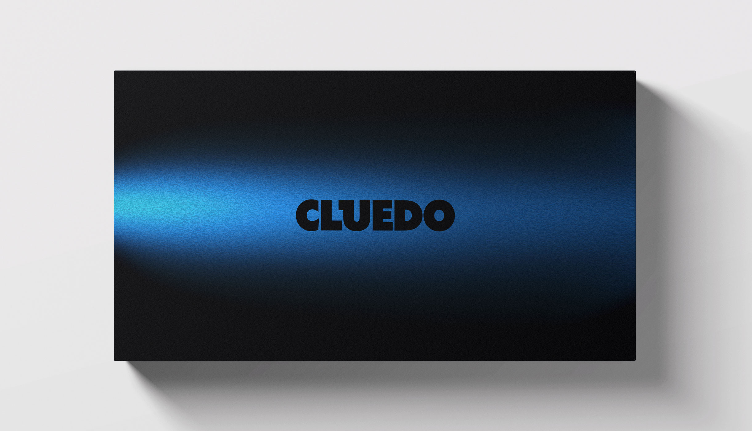
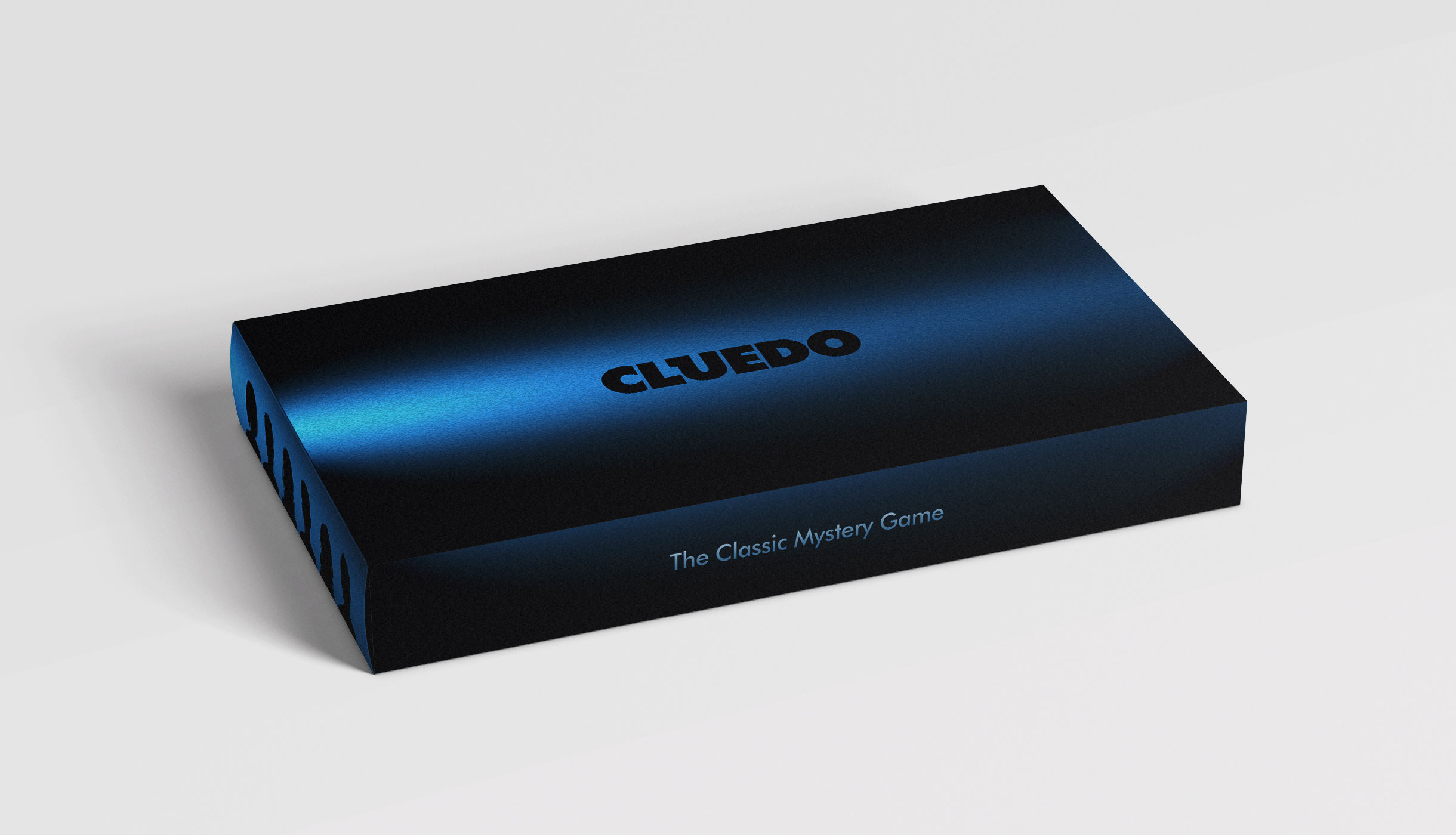
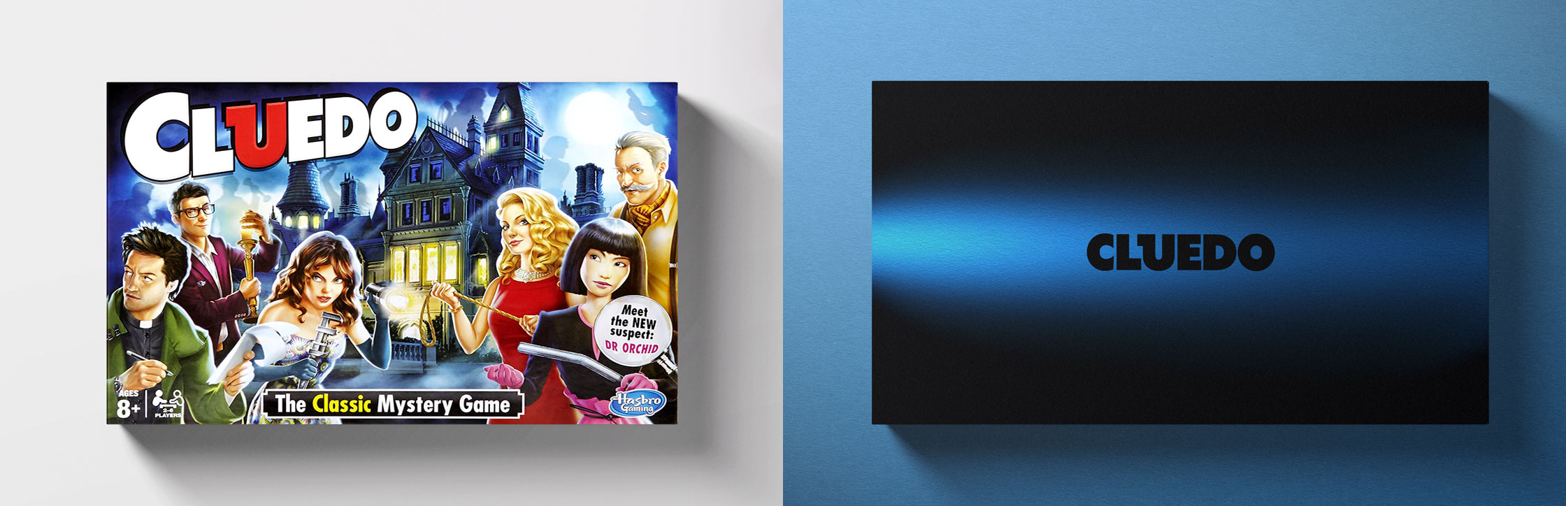
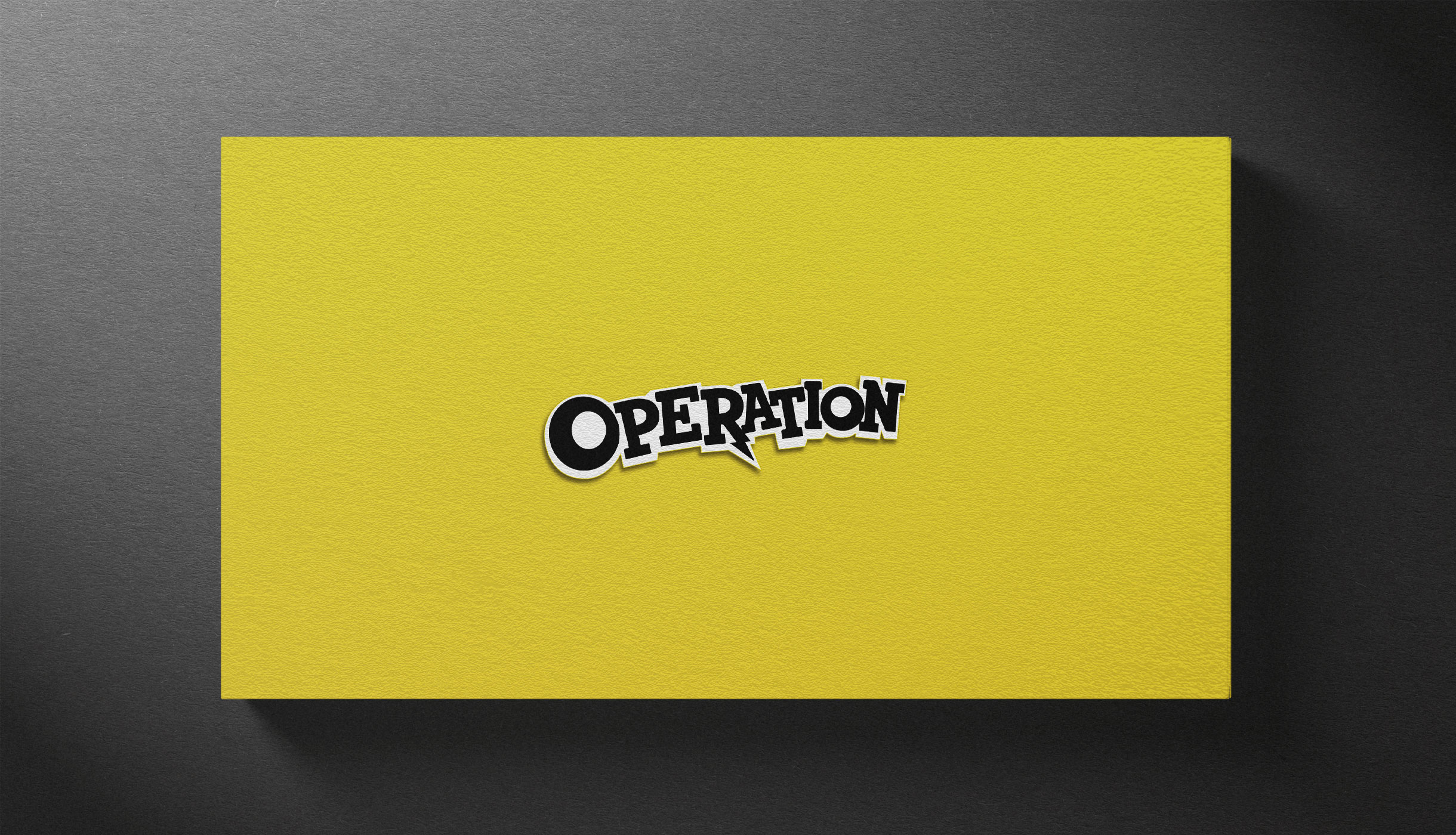
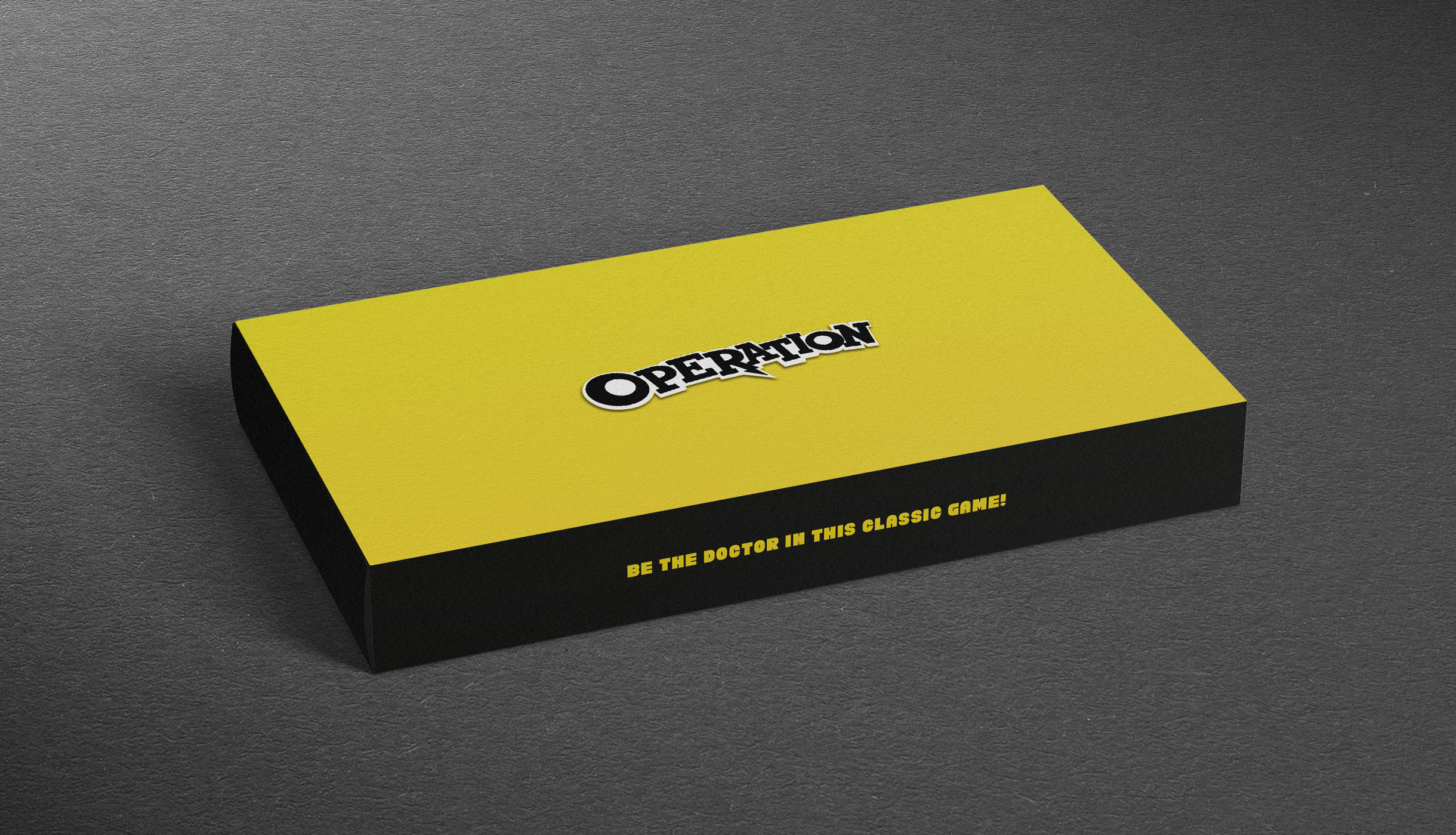
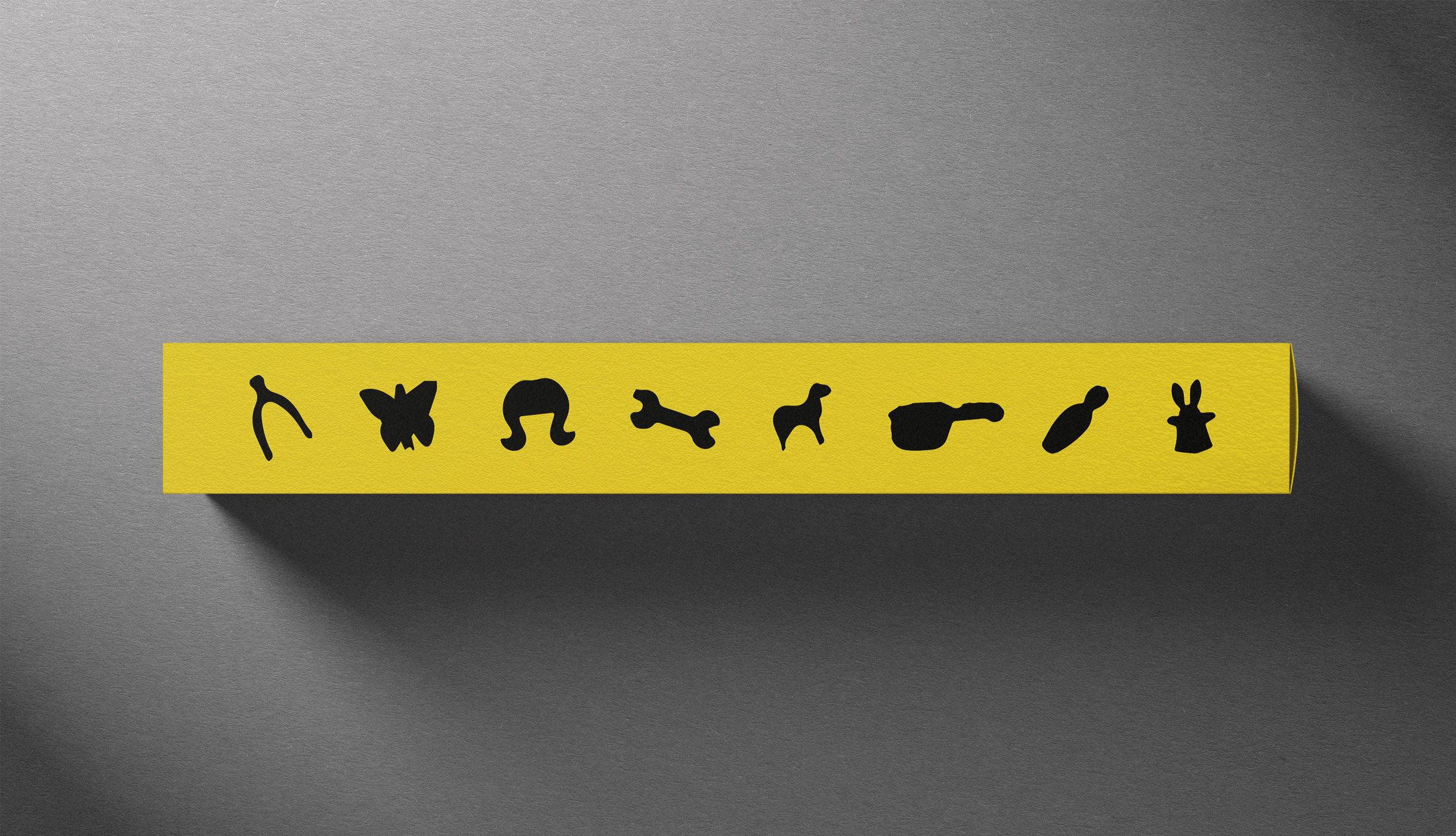
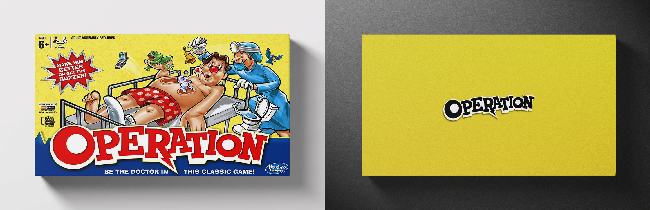
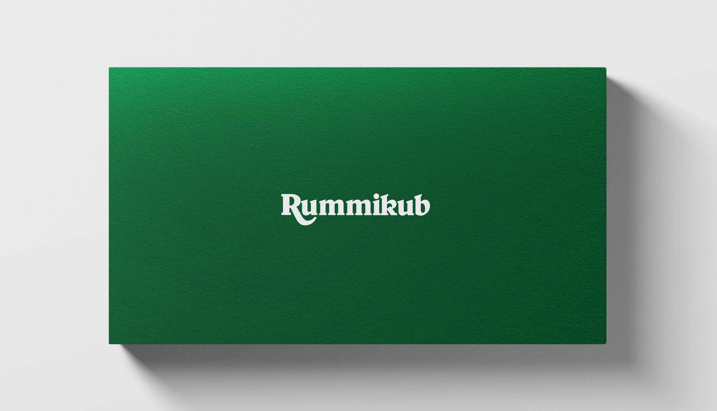
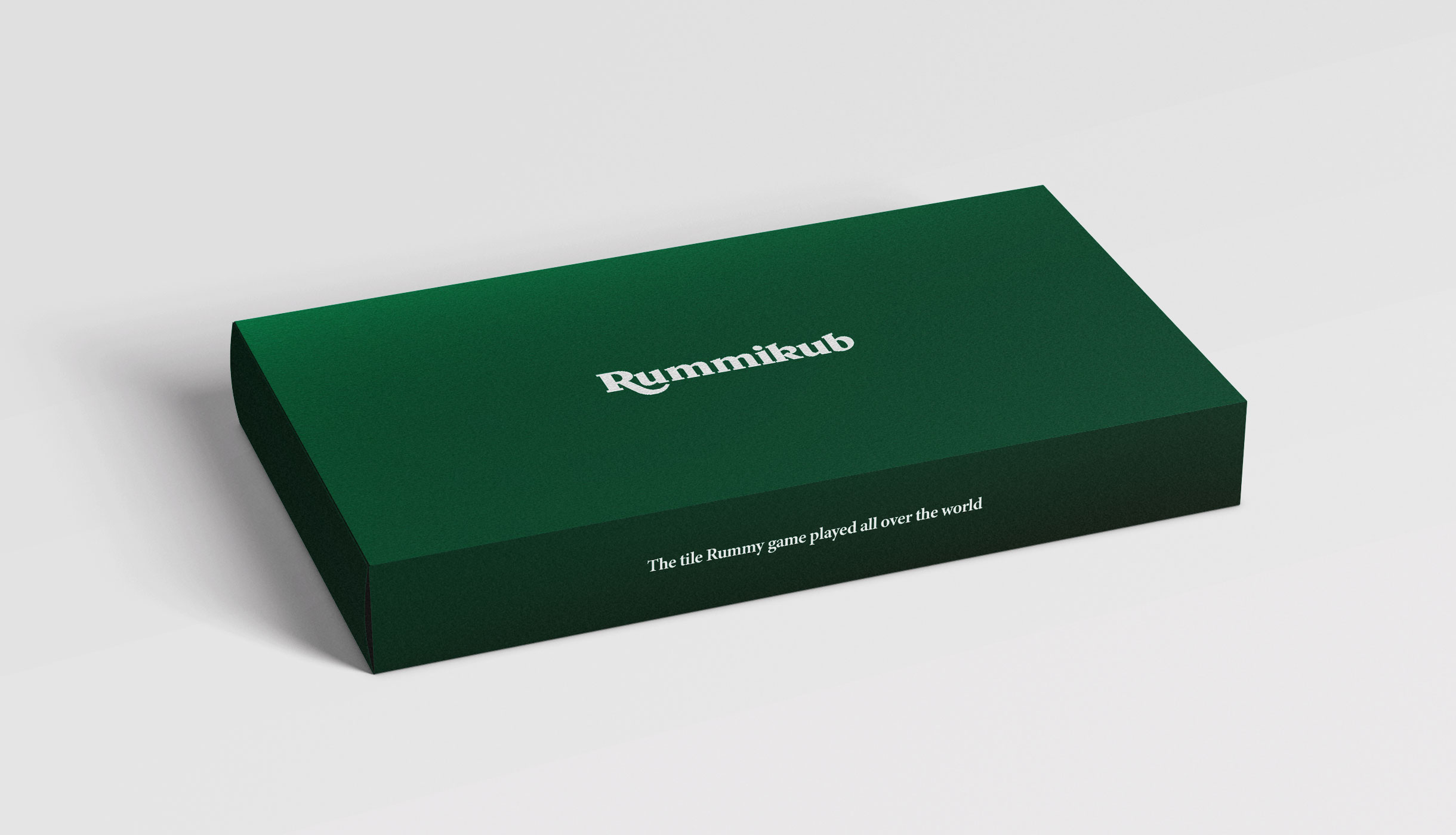
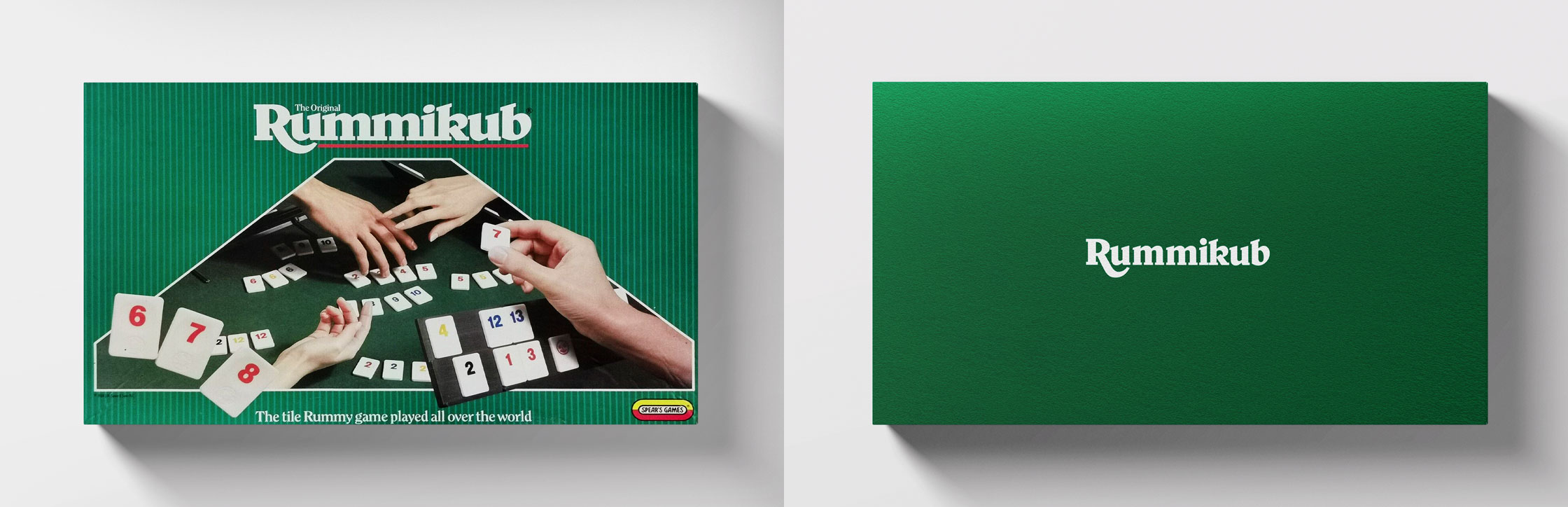
Classic board games have a distinct graphic style. They’re typically full of colour, energy, drop shadows, lively renders and things generally ‘pop’ to try and entice young kids and parents to pick them up.
But, what if a different design discipline was applied?
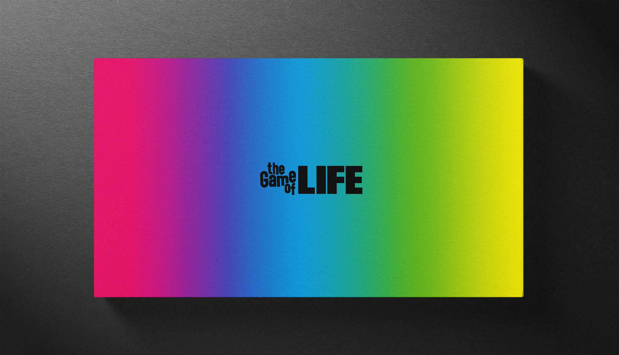
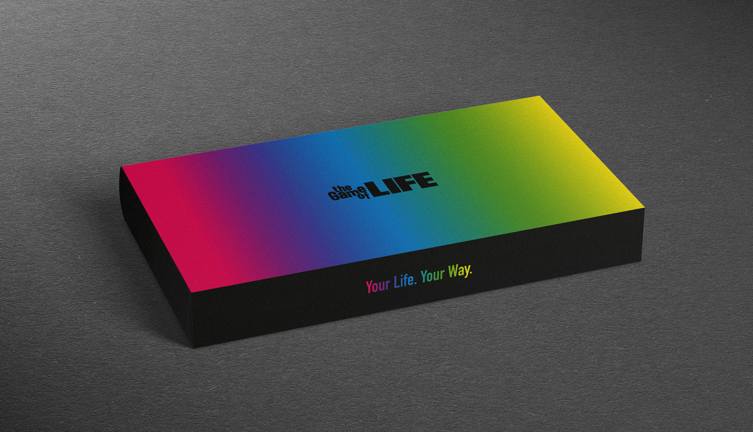
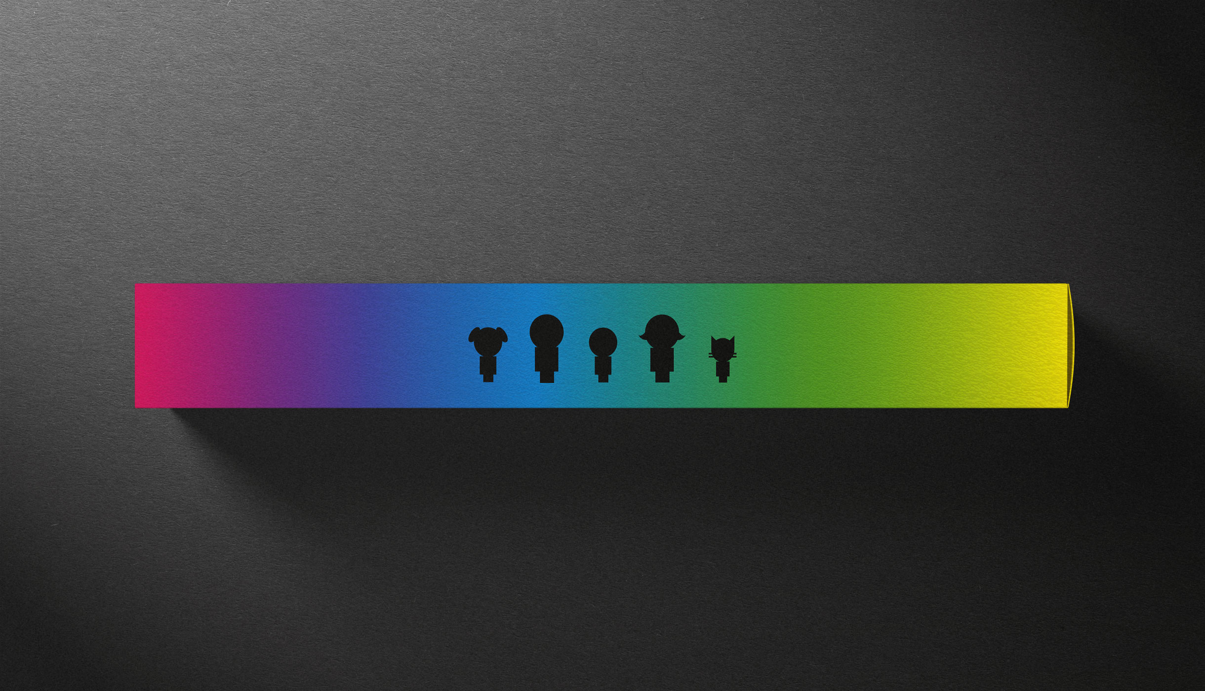
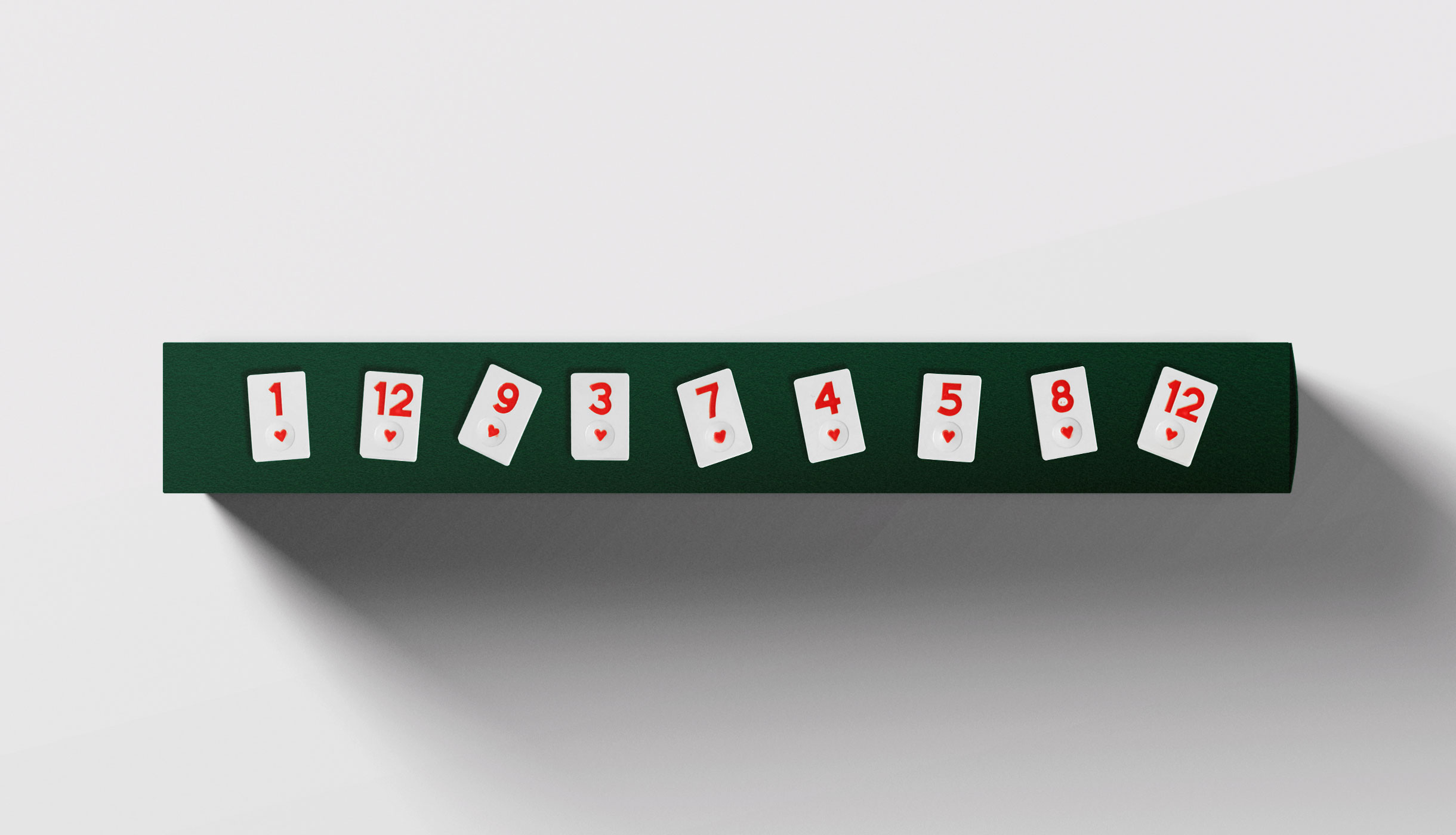
Could you take a more minimalist approach and still retain the brand essence? This was the question we posed ourselves for this self-initiated project, attempting to strip back the design of these classic games in order to test the visual strength of the respective brands, logotypes and graphic assets.
It’s been a fun and challenging project for our ideas team, testing out different levels of minimalism to try and arrive at a design that is striking yet unmistakably on brand.