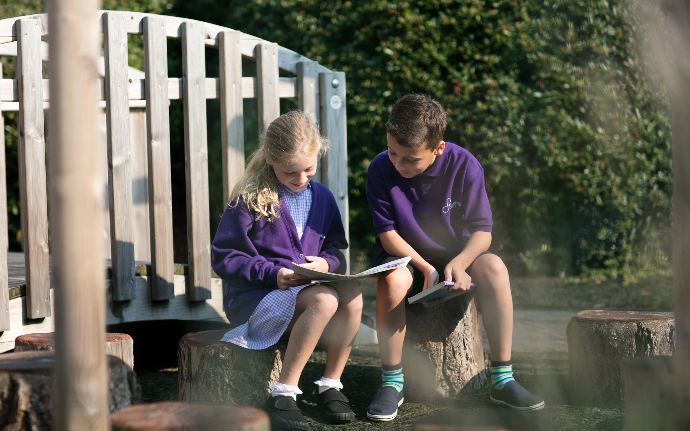
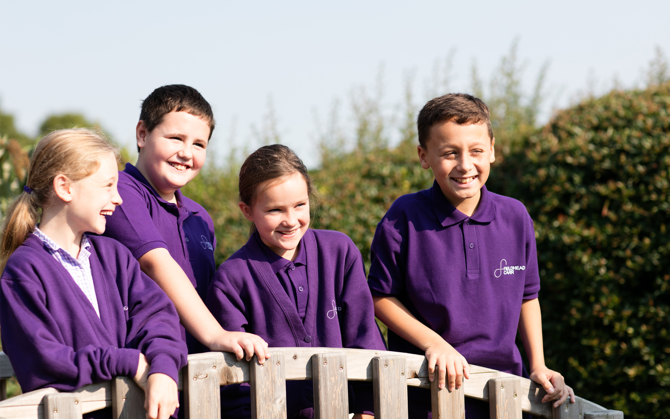
Primary Schools don’t do branding. They typically have logos created by pupils and it’s always a tree. Fieldhead Carr wanted something different. Arriving in a blaze of change, their new Headteacher had a vision for the school that uprooted any trees and ushered in a more sleek and corporate look, while retaining some fun and energy for the kids.
BRAND IDENTITY | LITERATURE | STATIONERY | SIGNAGE | WEBSITE
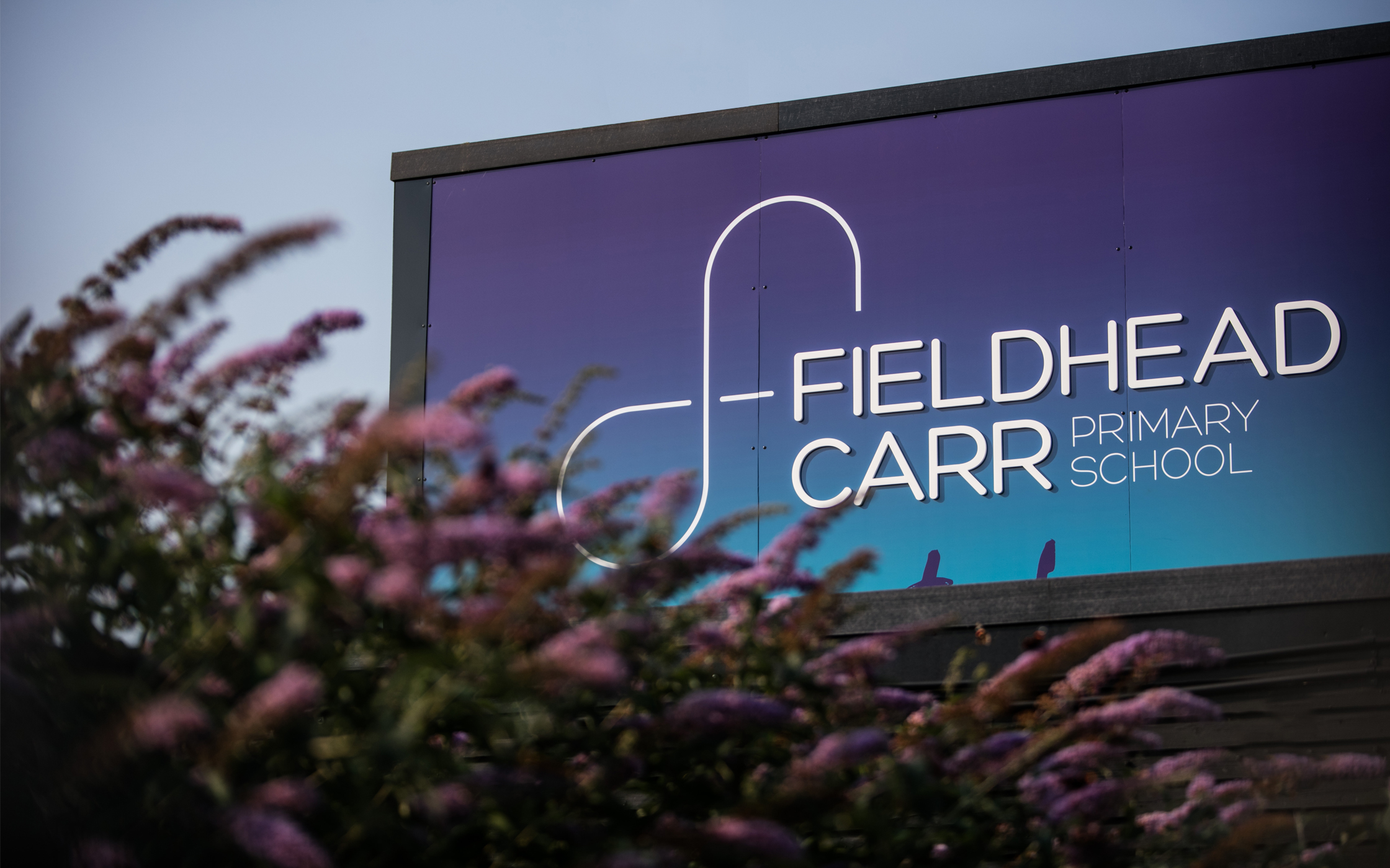

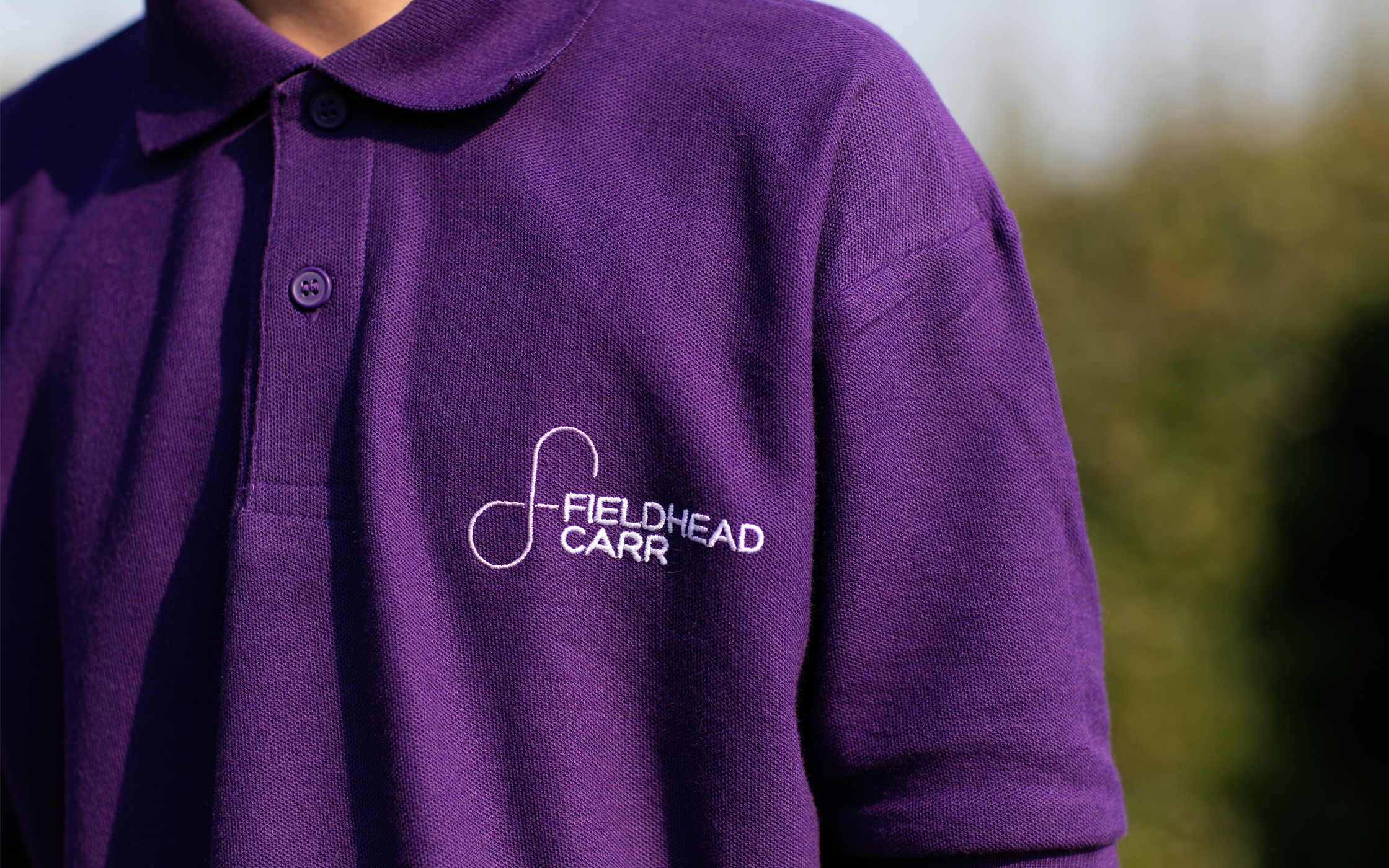
Learning that never stops. With our resolve to never use a tree, we set about designing a logo and icon. The idea came from the letters ‘f’ and ‘c’ interweaved together to emulate an infinity symbol. The idea being that learning never stops at school, and when a year group graduate another one is waiting in the line to start in reception.