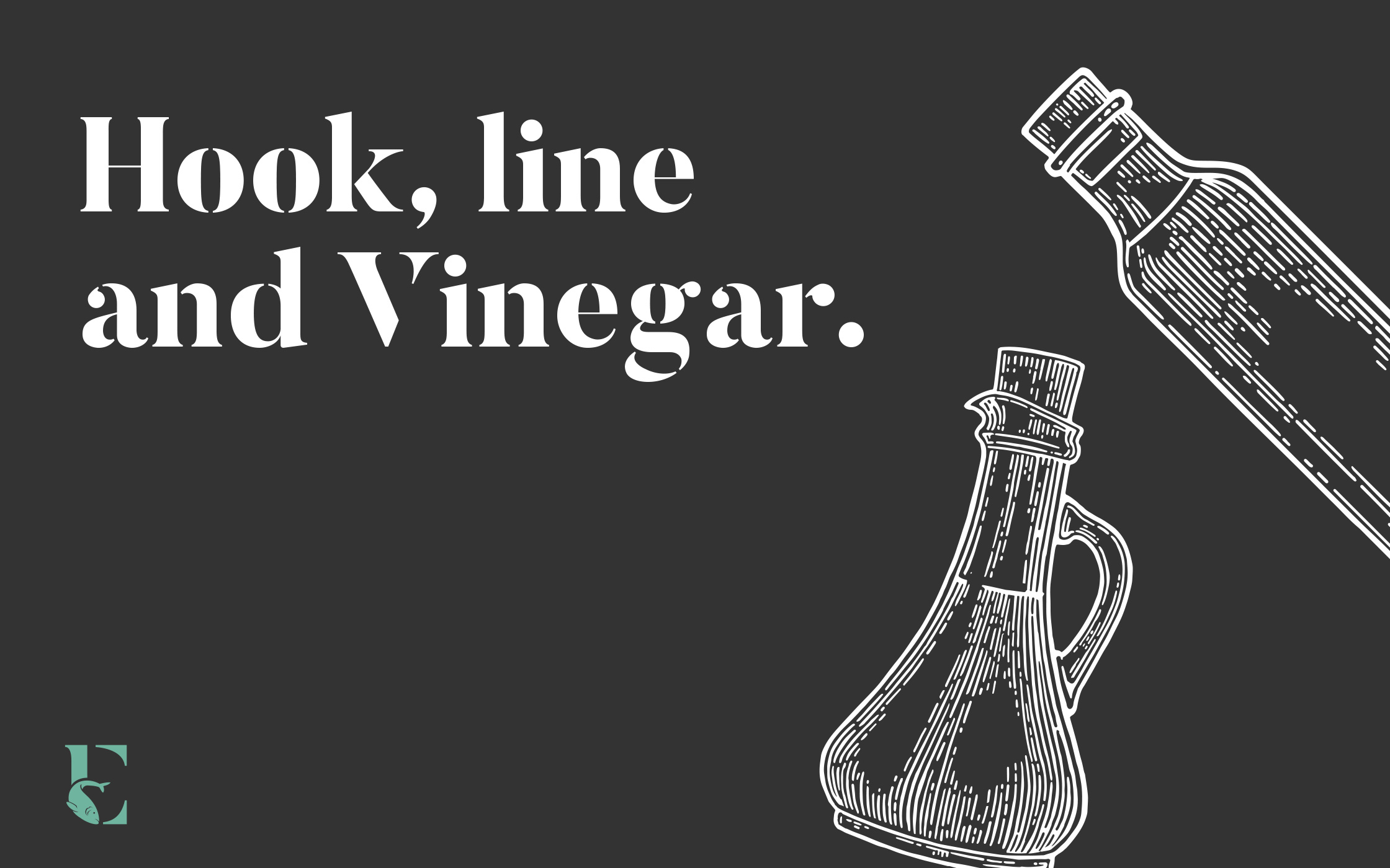
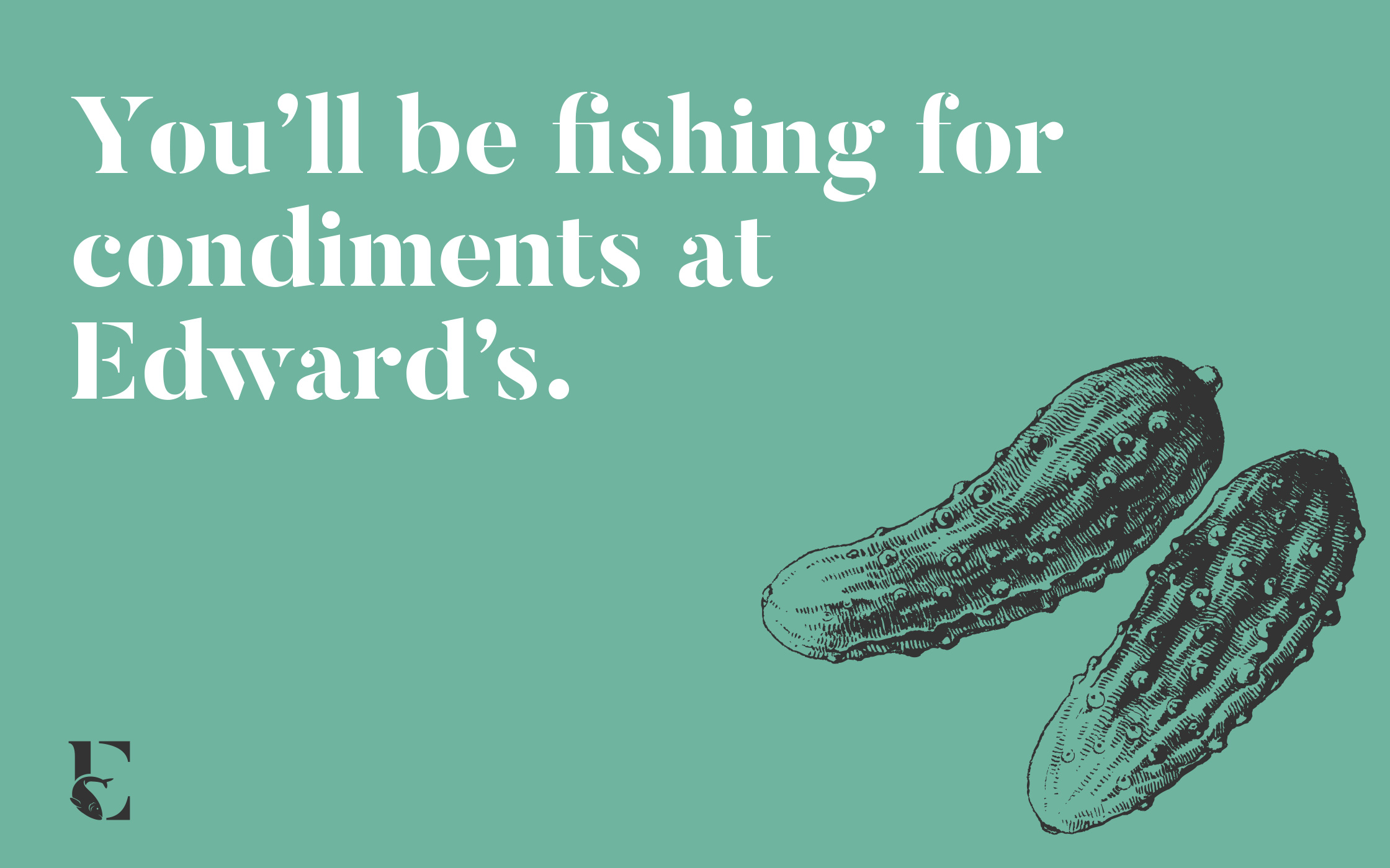
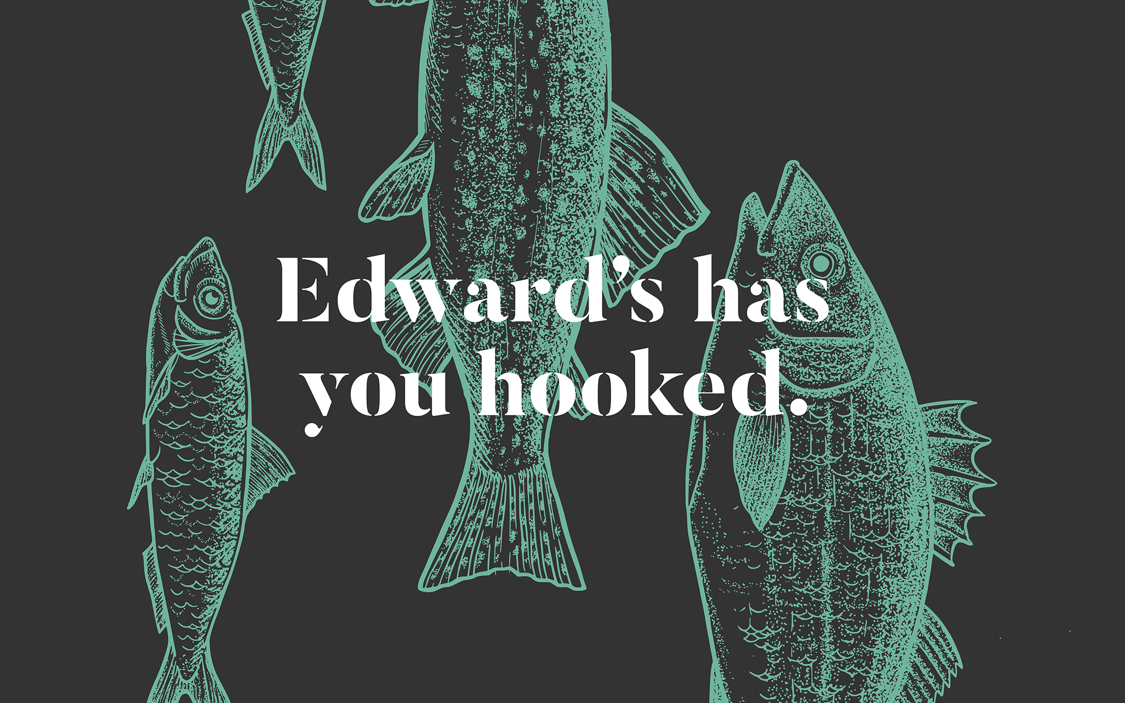
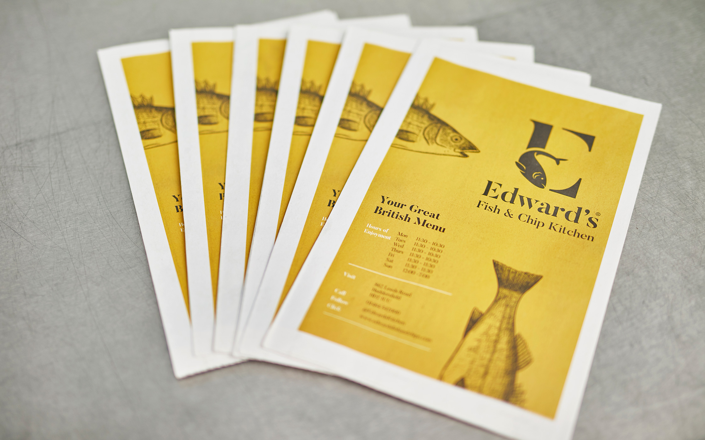
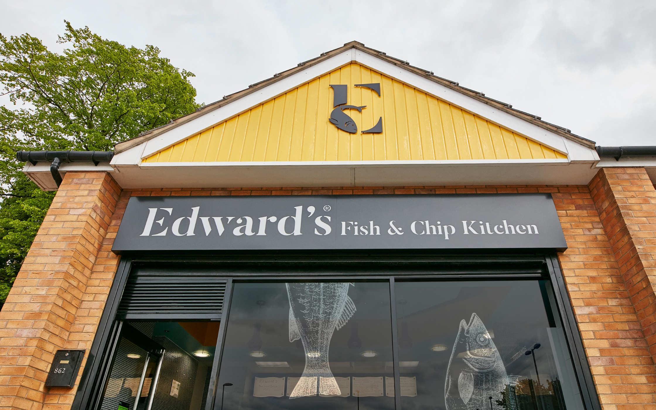
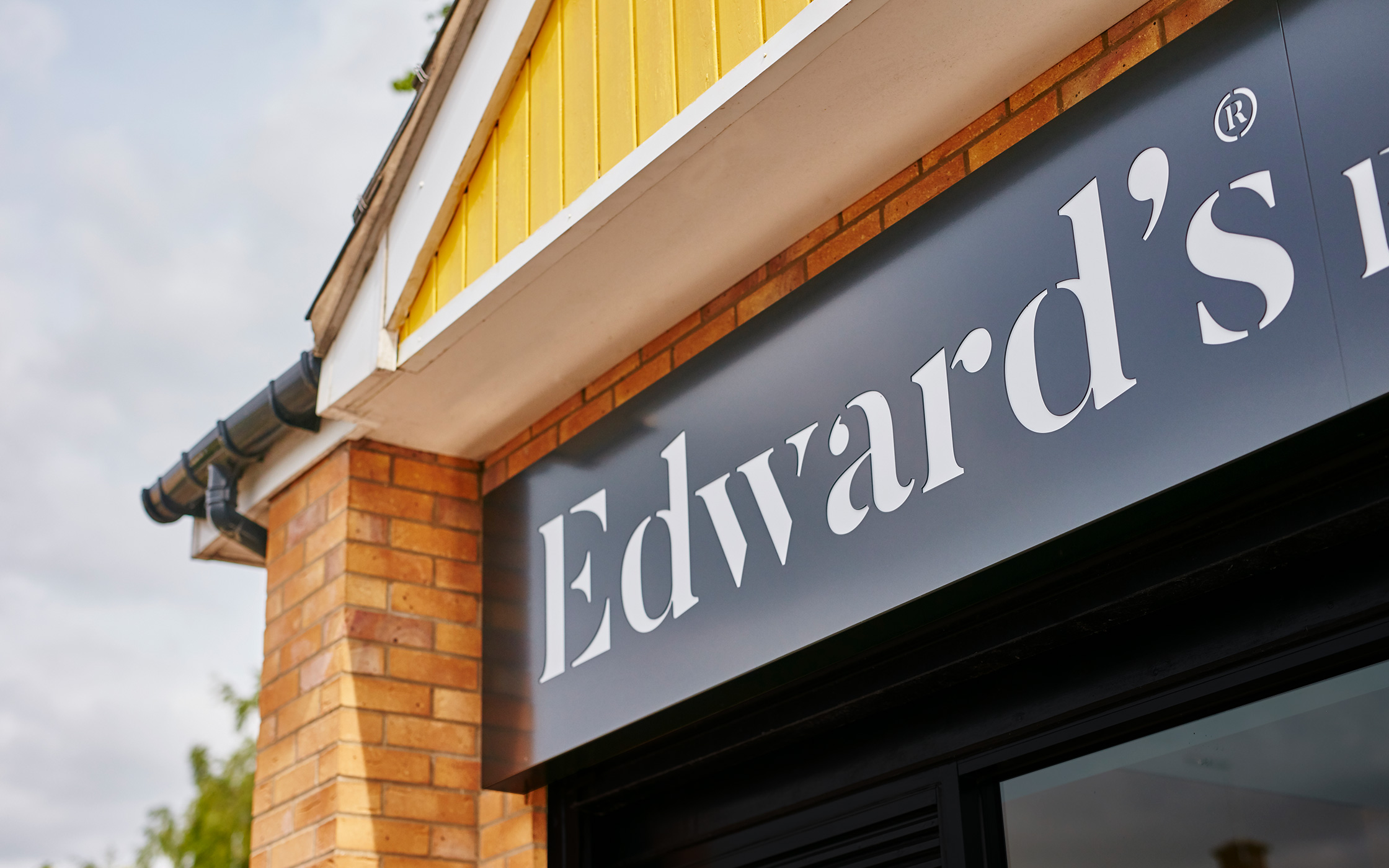
Rethinking the Chippy. The classic fish and chip shop, a regular feature on any street corner in Britain, often has no brand. Our strategy for Edward’s Fish and Chip Kitchen was to cook up a new look, one that was instantly recognisable and easily rolled out to another five restaurants as part of the growth plans.
BRAND POSITIONING | BRAND IDENTITY | PACKAGING | SIGNAGE | INTERIOR | WEBSITE
Sustainability on the menu.
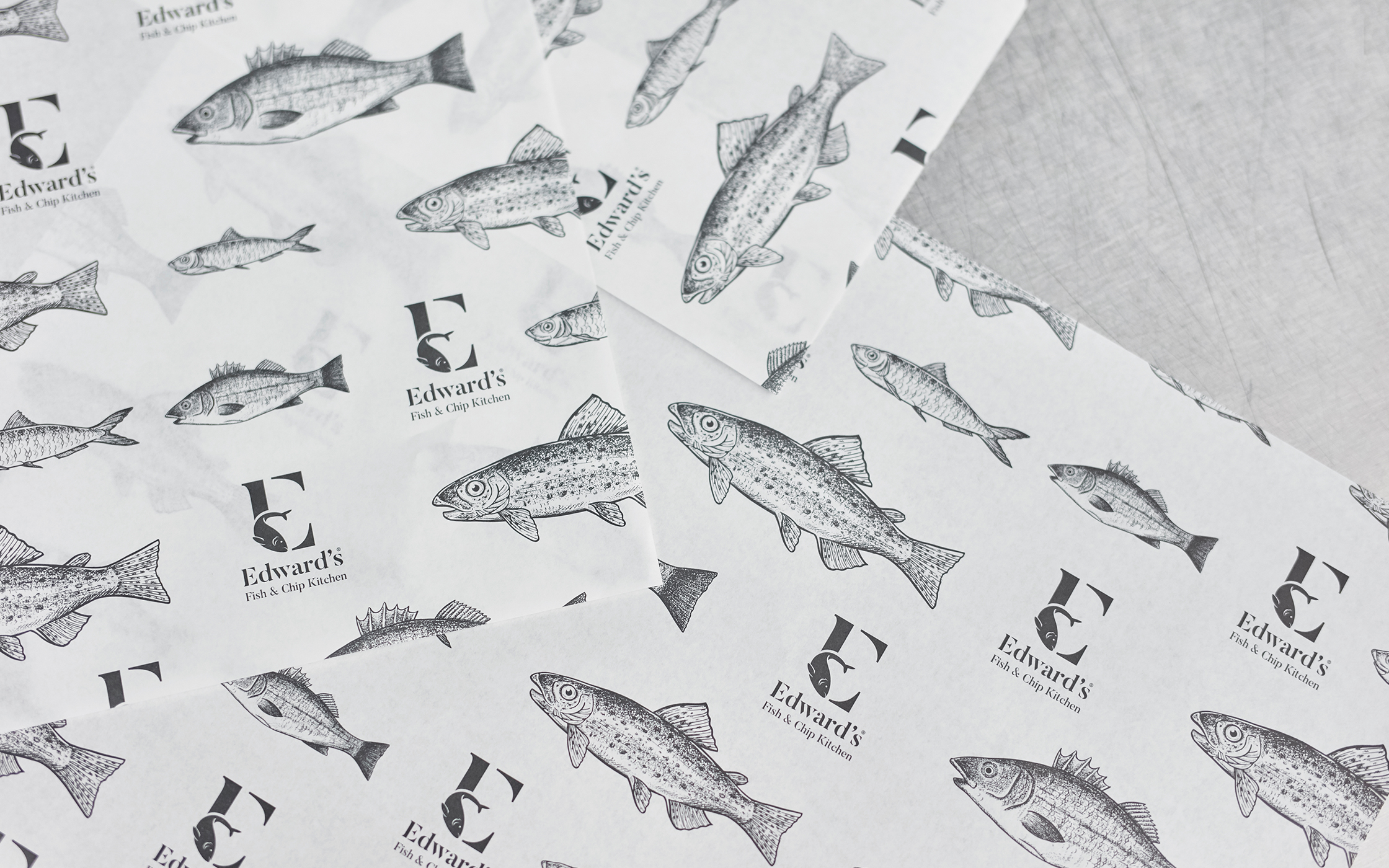
Edward’s are dedicated to providing 100% sustainably sourced food. It’s a personal mission by their founder David Holdsworth, who realises that we all need to play a part in ensuring our food choices are fit for the planet as well as our pockets. They are also proud to state that no single-use plastics are used in the restaurant.

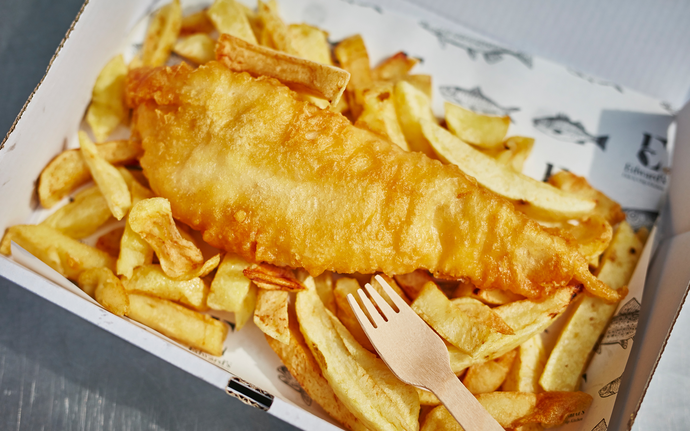
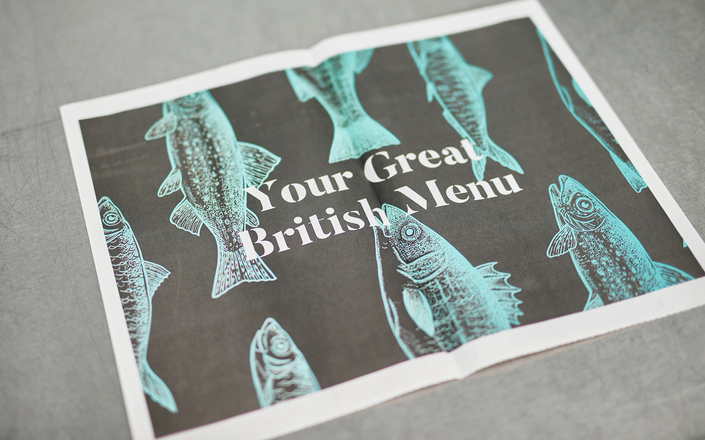
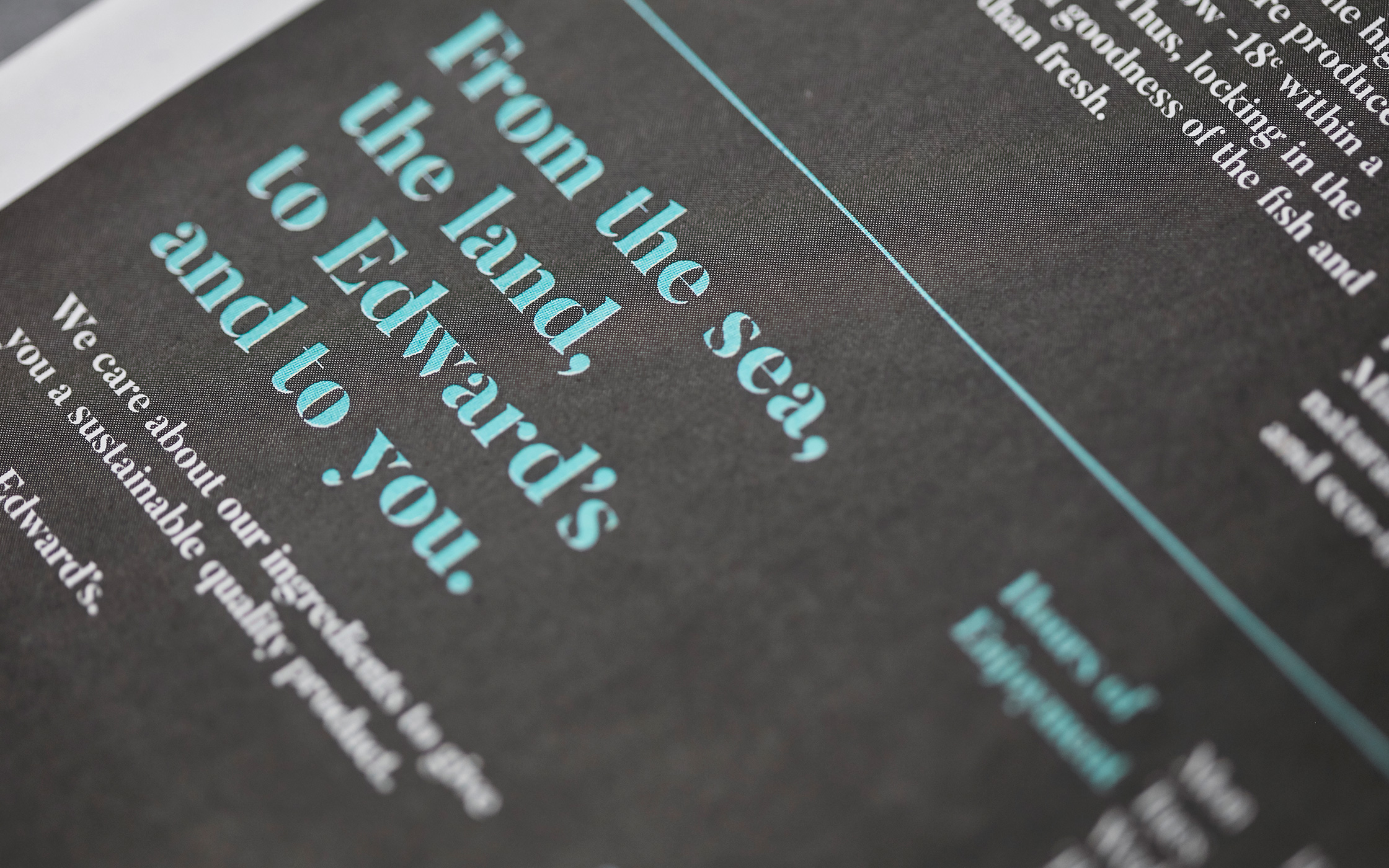
We injected some energy into the brand through clever copylines and hand-drawn illustrations. The Edward’s menu is printed like a newspaper to give nod to the old custom of wrapping fish and chips in actual newspaper. The colours and vibrancy create a striking and modern brand for a ‘chippy’!
